
Kitchen Cabinet Colors: White, Gray, Wood, and Bold for Manhattan Kitchens
The cabinet color decision locks in every other material downstream. In the Manhattan kitchens we’ve completed over the past three years, the color choice came first and set the direction for countertop selection, hardware finish, and appliance panel treatment. Flooring is the exception, and it runs the other way: in a co-op or condo, what the building permits underfoot gets settled before the palette, because that answer comes from the alteration agreement rather than from the design.
Kitchen cabinet colors split into two functional categories: neutrals that maximize resale flexibility, and bold statements that prioritize personal expression. Both are legitimate, but they require completely different approaches to everything that surrounds them.
White Kitchen Cabinets: Why They Still Lead
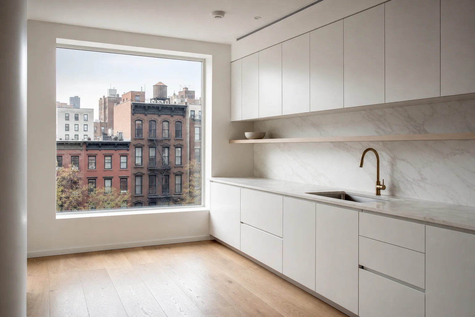
White remains the dominant cabinet color in Manhattan renovations because of what it does in a dim room. White reflects light in apartments where natural light is limited. In a north-facing galley kitchen in a pre-war Upper West Side co-op, white flat-front cabinets with a marble countertop can make a 9-foot-wide space feel workable. The same kitchen with dark cabinets feels like a service corridor.
White cabinets come in more surface variations than most clients expect. Flat matte lacquer looks clinical and contemporary. Warm off-white in semi-gloss leans traditional and welcoming. White oak painted white in matte sits closer to the restraint of japandi, the pared-back Japanese and Scandinavian hybrid that has shaped the last few years of kitchen design. These are not interchangeable, and the wrong white in the wrong apartment looks either sterile or cheap.
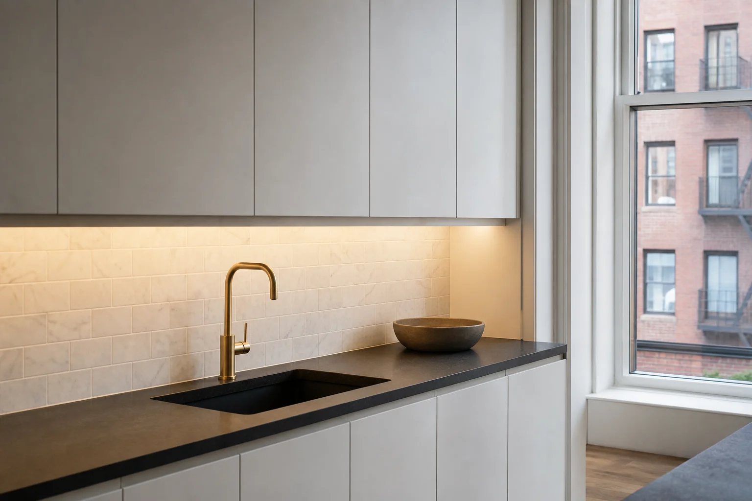
Pairing white cabinets with black countertops works when the black is genuinely deep: honed black soapstone, absolute black granite, or matte black quartz. If you are going for contrast, the countertop needs to be visually unambiguous. A medium charcoal against white cabinets looks like indecision rather than a decision.
Gray and White Kitchen Cabinets
Gray and white is the second most common combination in Manhattan renovations, particularly in postwar buildings from the 1960s through 1980s, where all-white feels too stark and warm wood can look dated.
The split between gray uppers and white lowers, or the reverse, gives the kitchen visual weight at the base while keeping the upper zone light. This matters most when ceiling height is under 9 feet, which covers most postwar Manhattan apartments: all-dark upper cabinets make low ceilings feel oppressive.
Hardware decides whether gray cabinets land as contemporary or transitional. Brushed brass pulls on medium gray stay warm. Matte black on cool gray pushes industrial. Polished chrome tends to date faster than either. Polished nickel is a different case and worth separating out: in pre-war buildings where original moldings, hinges, and bath fittings are still in place, it is the historically correct finish and holds up well. Judge the finish against the apartment rather than against a general rule.
Wood Kitchen Cabinets: White Oak and Natural Grain
Natural wood cabinets in Manhattan are driven by the japandi influence and a reaction against the all-white kitchen that dominated the previous decade. White oak in flat-grain natural finish is the material of this moment: not stained, not pickled, not whitewashed. Natural grain with minimal treatment.
The practical consideration for wood cabinets in NYC apartments: wood shows fingerprints and cooking residue more visibly than painted finishes. In kitchens used daily for real cooking, that means more maintenance. In a pied-à-terre or a lightly used secondary kitchen, the warmth of white oak is hard to match with any painted finish.
Wood-on-wood combinations work in large kitchens where each element has room to stay distinct, such as white oak cabinets against a walnut island. In tight Manhattan galleys, three wood tones compete and the kitchen looks cluttered. Pick one wood element as primary and treat everything else as contrast. If the floor is part of that composition, confirm what the building permits before it goes into the drawings. Replacing flooring in a co-op or condo is governed by the alteration agreement, and the restriction is almost always about sound reaching the apartment below. Buildings enforce it one of two ways. Newer agreements set a minimum impact insulation class, the IIC rating, which measures how much footfall noise a floor assembly stops. Older ones keep the rule that at least 80 percent of the floor area outside the kitchen and baths stays carpeted. That constraint is set by the building, and it does not move to accommodate a cabinet finish.
| Cabinet color | Best pairing | Light reflection | Best suited to | Maintenance |
|---|---|---|---|---|
| White matte lacquer | Calacatta marble, white quartz | Highest | North-facing and interior kitchens, galleys under 10 ft | Low |
| White with black countertop | Honed soapstone, absolute black granite | High | Pre-war kitchens with existing millwork detail | Low |
| Gray and white two-tone | Quartzite, light concrete | Medium-high | Postwar apartments, ceilings under 9 ft | Low |
| Natural white oak | Honed white stone | Medium | South- and west-facing kitchens, light-use and pied-à-terre | Medium |
| Navy blue | Unlacquered brass hardware, light stone | Low-medium | Kitchens over 150 sq ft with ceiling height to carry it | Low |
| Sage green | Warm white stone, brushed bronze | Medium | Pre-war co-ops with crown molding and parquet | Low |
A note on the resale rankings that circulate in color guides, including tables like the one above: no public dataset isolates cabinet color from the rest of a renovation, so any score assigned to a color on resale is an estimate rather than a measurement. The defensible version is narrower. Neutrals require no explanation at a showing. Saturated colors narrow the buyer pool and suit owners who plan to hold the apartment rather than list it. Everything between those two poles is a judgment call about the specific apartment, not a ranking.
Bold Cabinet Colors: Green and Blue in NYC Apartments
Sage green lower cabinets with white uppers have settled into Manhattan renovations as an established choice rather than a temporary trend. Sage occupies a useful middle ground: deliberate without being aggressive. In a pre-war co-op with crown molding and herringbone parquet, sage lowers integrate more easily than navy, which can feel heavy in kitchens under 150 square feet.
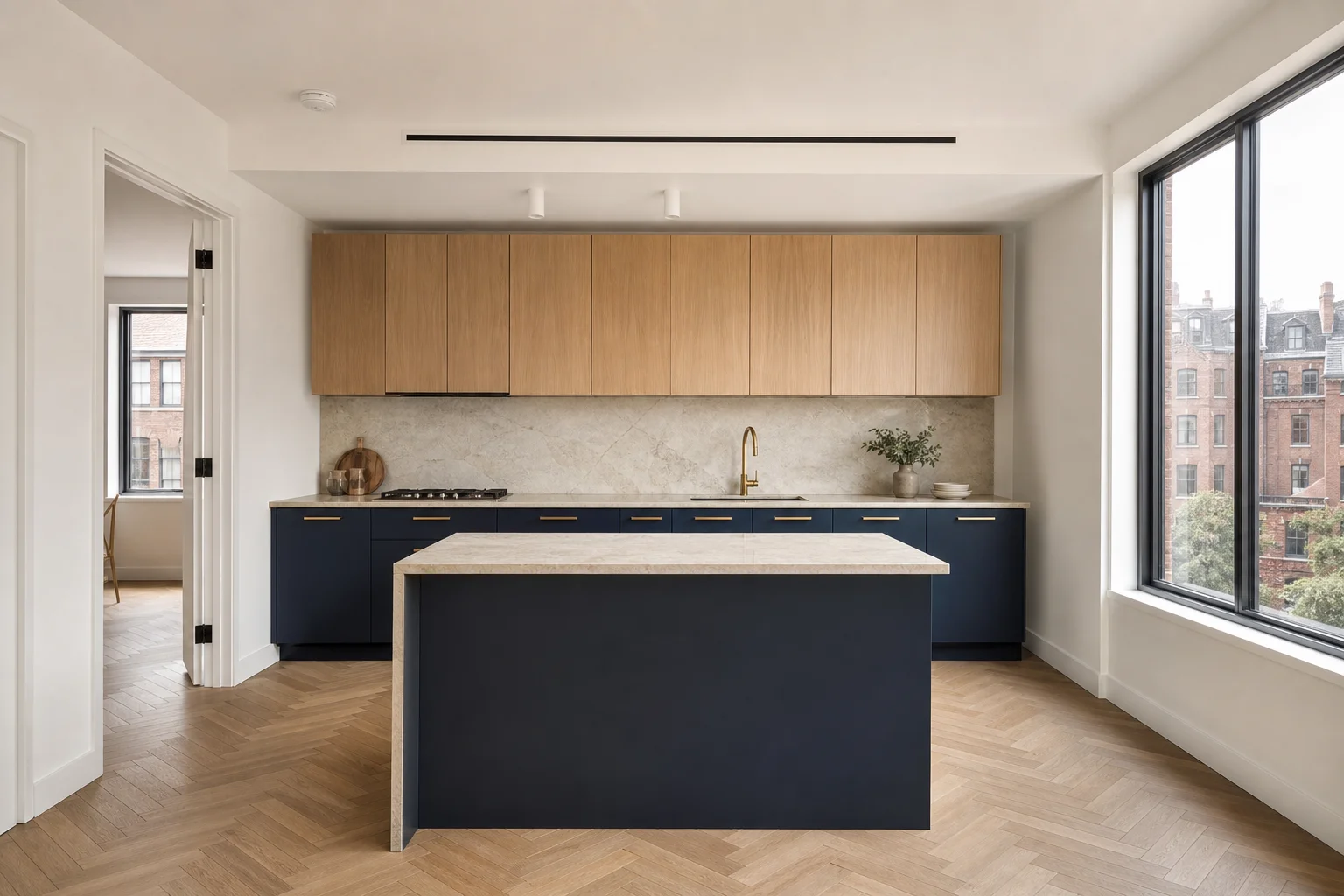
Navy works where there is floor area and ceiling height to carry it, which in practice means larger postwar layouts and the more generous pre-war kitchens rather than one era or the other. The historical associations of navy and white translate comfortably to both. Navy lowers with white or white oak uppers and unlacquered brass hardware look intentional across a wide range of budgets, from semi-custom to full custom cabinetry.
Green cabinets turn warmer and earthier against warm stone such as travertine or honed Calacatta with warm veining, and sharper against cool white quartz. Hardware pushes it further in either direction: brushed bronze keeps sage green artisanal, matte black makes it graphic.
Two-Tone Cabinet Combinations: Upper and Lower
Two-tone cabinet combinations have become the default in Manhattan renovations where a single color feels either too spare or too heavy. The formula that works most consistently: light or white uppers, color or wood lowers. Dark uppers over light lowers are harder to execute, because dark upper cabinets pull the ceiling down and compress the room.
The split-level approach also manages renovation costs in occupied buildings. Painting existing lower cabinets and replacing only the uppers is a common approach in co-ops where owners want to update without committing to a full gut renovation. Four things need to be settled before the contractor arrives, and they are easier to handle in this order.
The first is the building paperwork. Cabinet color is a cosmetic decision in design terms, but in a co-op what triggers building review is bringing a contractor into the apartment, not the structural weight of the work. Cabinet replacement falls under a decoration agreement or minor alteration agreement, a short-form document distinct from the full alteration agreement used for gut renovations. It is often approved by the managing agent without a full board meeting, sometimes within a week, which makes it faster than most owners expect rather than something to work around.
What it does require is paperwork from your contractor before anyone starts. The central document is a certificate of insurance naming both the co-op corporation and the managing agent as additional insureds, which means the building is covered under your contractor’s policy if something goes wrong. Coverage is commonly set at $1 million per occurrence and $2 million aggregate in general liability, plus workers’ compensation and disability. Beyond insurance, the building will want scheduled elevator access, confirmation that your crew works only within permitted hours, and a plan for removing debris. A contractor without a current certificate on file for that building does not get past the service entrance.
The second is the electrical scope. Replacing uppers rarely stays cosmetic. A new run of cabinets at a different height or depth moves undercabinet lighting and the outlets above the counter. Swapping a fixture like for like on an existing, code-compliant junction box requires no permit. Adding a junction box, running new wire, or changing a circuit requires a New York City Licensed Master Electrician and an electrical permit. Establish which of the two you are doing during design, because it changes both the schedule and the filing.
The third applies only if the work crosses into permit territory, and it is new this year. Since February 2026, when a filing in DOB NOW lists the owner as a condo unit owner or a co-op tenant-shareholder, the board is automatically added to the filing as a stakeholder, and a board representative has to attest within the system that the applicant was authorized to file. Board sign-off and the DOB filing used to run on parallel tracks. They no longer do for apartment owners: the filing waits on the attestation, and industry estimates put the addition at two to four weeks. Build that into the sequence rather than discovering it after the cabinets have been ordered.
The fourth is appliance sequencing, and it applies whenever the plan includes panel-ready units. Confirm that the specific model carries New York City acceptance through the Department of Buildings’ Office of Technical Certification and Research, which handles material and equipment acceptance, before cabinet fronts go into production. Some 24-inch European dishwashers and several European refrigerator lines do not have it. Panels are fabricated to a model’s exact dimensions and hinge geometry, so substituting an appliance after shop drawings are approved means paying for new panels, not just a new appliance.

The New Language of Luxury: Comfort, Quiet, and the Power of Restraint
Once upon a time, luxury was loud. It sparkled, it demanded attention, and it announced itself throu
Furniture Placement Rules Designers Use in Open Layouts
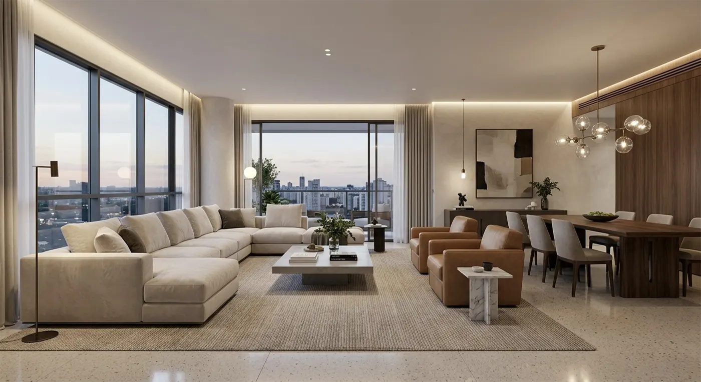
The open layout is one of the most requested outcomes in Manhattan apartment renovations, and one of
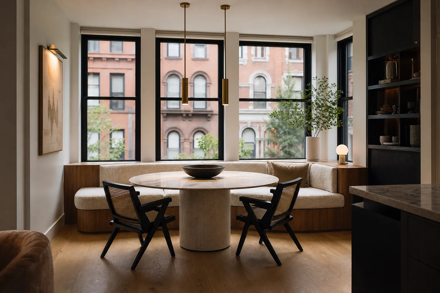
Small Dining Rooms and Breakfast Nooks in NYC Apartments
A small dining room can be comfortable and useful if the layout and the pieces fit the footprint. Th