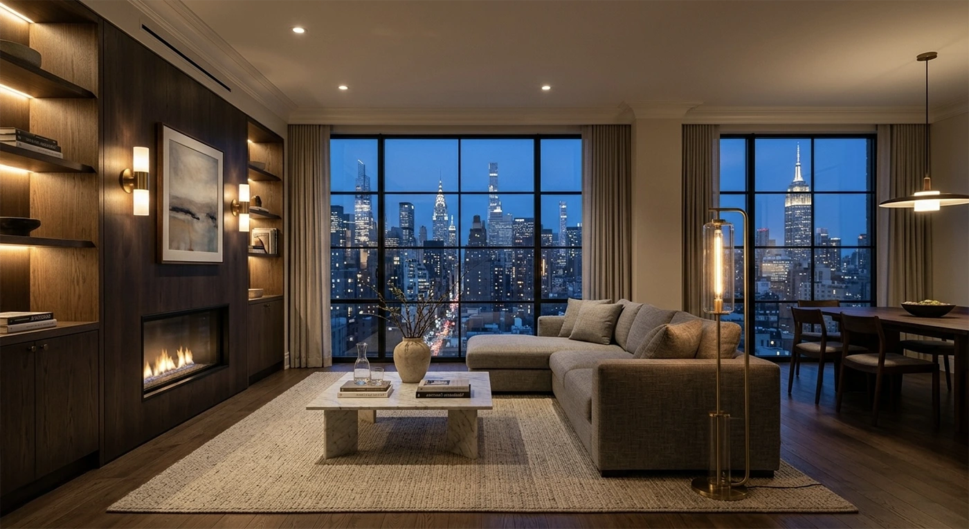
The Architecture of Light: How Professional Lighting Design Changes Interior Perception
Before selecting fixtures, it helps to understand how the eye actually reads space.
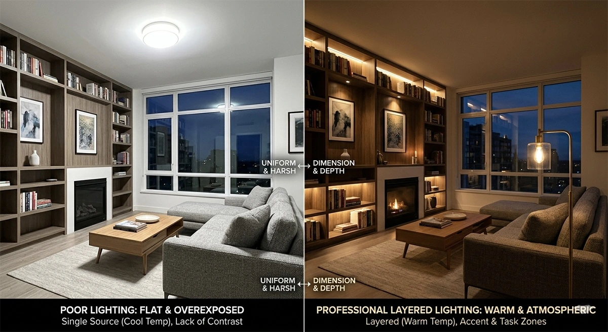
Human perception is contrast-driven. We do not perceive brightness in isolation; we perceive relationships between bright and dark surfaces. A room with evenly distributed 300 lux can feel dim if there is no vertical illumination. Conversely, a room with moderate horizontal light but bright vertical planes will feel more luminous and expansive.
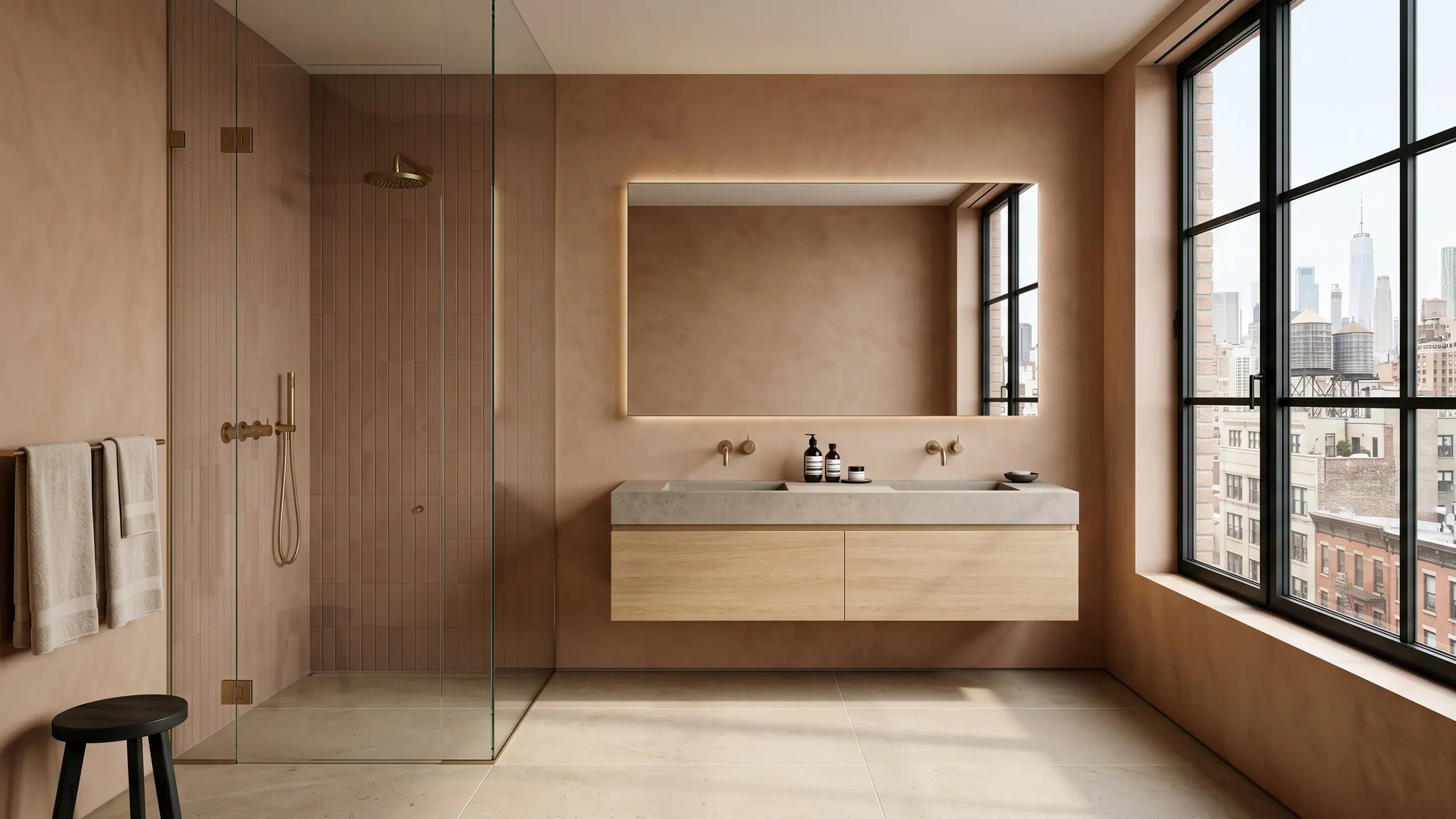
Vertical illuminance is therefore one of the most powerful design tools in compact urban interiors. Illuminated walls increase perceived brightness without dramatically increasing energy load. This is why wall washing, cove uplighting, and concealed perimeter lighting feel more generous than a grid of downlights.
Color perception is equally physiological. The human visual system adapts quickly to color temperature shifts, but inconsistencies between adjacent fixtures are immediately noticeable. Mixing uncontrolled 2700K and 3000K sources in the same field creates visual noise. Precision in specification is not aesthetic obsession; it is perceptual hygiene.
Finally, glare sensitivity increases with age. High-end residential lighting must assume a broad range of visual acuity. Low-glare optics, deeper regress, and controlled beam distribution are not luxuries. They are long-term comfort decisions.
Designing With Contrast Ratios, Not Just Lux Targets
While lux establishes baseline function, contrast ratio determines atmosphere.
A common strategy in refined interiors is to maintain a 3:1 to 5:1 contrast ratio between focal elements and ambient field. Artwork, textured walls, or dining tables may sit slightly brighter than the surrounding field, guiding the eye without theatrical exaggeration. Exceeding 10:1 contrast begins to feel dramatic and is appropriate for gallery-style environments but often too sharp for residential calm.
In smaller Manhattan rooms, restraint is critical. Over-lighting flattens depth. Under-lighting compresses volume. The objective is controlled hierarchy: bright where activity occurs, softer where rest and transition happen.
Beam Geometry as a Spatial Tool
Beam angle is frequently specified generically, yet it directly shapes spatial legibility.
- Narrow beams (10–25°) — create crisp highlights, appropriate for art or pronounced texture
- Medium beams (30–40°) — provide controlled pools for dining tables or seating groups
- Wide beams (60°+) — support ambient fill but must be shielded carefully to prevent glare
Spacing also matters. Downlights spaced too far apart create scalloping and visual patchiness. Spacing too tightly creates over-illumination and ceiling clutter. As a rule of thumb, spacing approximates mounting height for wide beams, and narrows proportionally for tighter optics, but photometric modeling should confirm performance rather than relying on intuition.
Precision in beam selection is one of the clearest distinctions between decorative lighting and architectural lighting.
The Ceiling as a Reflector Plane
In many New York apartments, ceiling height is limited. Rather than fighting that constraint, use it.
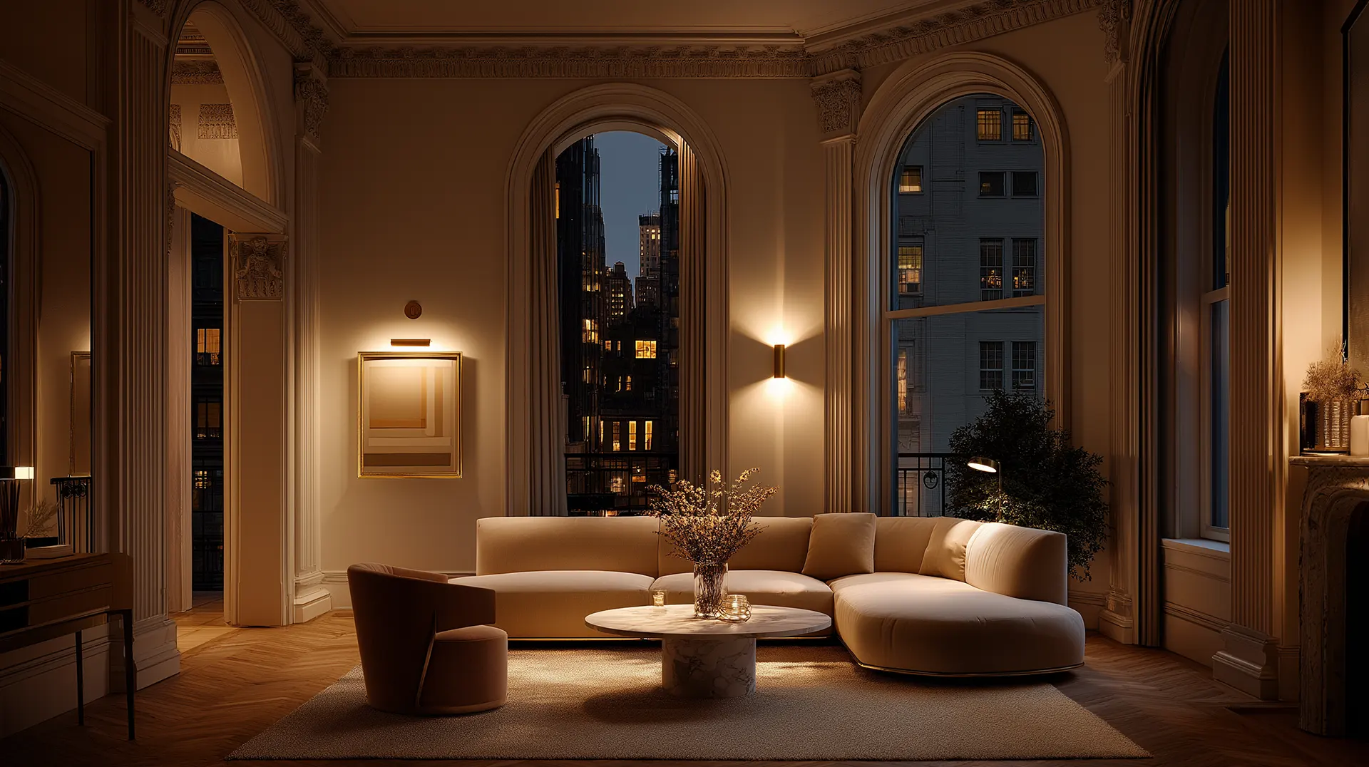
A matte white ceiling with high reflectance becomes a secondary light source when illuminated indirectly. Cove lighting aimed upward allows the ceiling plane to bounce soft light back into the room, reducing shadow contrast and visually lifting the height.
This strategy is particularly effective in pre-war apartments where plaster ceilings can carry subtle texture. Indirect light reveals that texture gently without emphasizing imperfections.
However, ceiling reflectance must be considered during finish selection. Dark ceilings absorb uplight and negate the lifting effect. When a dark ceiling is part of the design language, compensate with vertical wall illumination and carefully controlled perimeter lighting to preserve depth.
Integration With Millwork and Architecture
Lighting that feels intentional is integrated, not appended.
- Linear LEDs should align precisely with millwork reveals
- Recessed apertures should coordinate with ceiling grid logic
- Cove dimensions must accommodate thermal management and driver access
- Wardrobe interior lighting should be concealed behind vertical partitions or integrated into door frames to avoid visible diode glare
Coordination drawings are not optional at high levels of finish. Lighting locations should be locked before final millwork shop drawings are approved. HVAC diffusers must avoid casting unwanted shadows or disrupting beam patterns. Even sprinkler heads affect visual rhythm.
When lighting is designed concurrently with architecture, it disappears into the composition while elevating it.
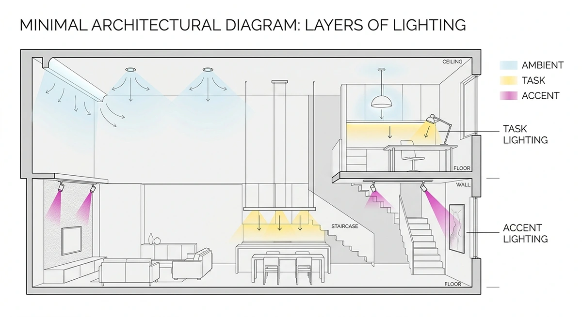
Human-Centric Lighting in Residential Context
Tunable white systems, often described as human-centric lighting, are increasingly practical in luxury residential environments.
Morning scenes can shift toward 3500K to encourage alertness and visual clarity. Evening scenes can warm toward 2200 to 2700K to support relaxation. The key is subtlety. Abrupt or extreme shifts feel artificial. Gradual transitions tied to time-of-day automation preserve comfort.
In dense urban environments where daylight exposure may be limited by neighboring buildings, tunable systems help regulate circadian rhythm. However, they require thoughtful control programming. Without scene discipline, tunable systems become underused features.
Energy Codes and Performance Constraints
Lighting design in New York must also comply with energy codes that regulate lighting power density and control requirements.
High-efficacy LED sources make compliance straightforward, but zoning and automatic shutoff requirements must be integrated into the electrical design early. Occupancy sensors, daylight dimming controls near facades, and programmable timers are often mandatory.
Luxury does not exempt a project from performance regulation. The most refined projects meet energy code requirements invisibly, without compromising atmosphere.
Glare: The Most Common Luxury Failure
High-end finishes magnify glare problems.
Polished marble, lacquered millwork, and large-format mirrors amplify poorly shielded light sources. Recessed fixtures should have deep baffles or blackened interiors to reduce high-angle brightness. Linear fixtures must use quality diffusers that eliminate pixelation. Pendant luminance should be evaluated from seated eye level, not standing.
A room can meet every lux target and still feel uncomfortable if glare is uncontrolled. Comfort is often achieved by reducing peak luminance rather than increasing total light.
Mockups and Field Verification
Even with photometric modeling, field verification is essential.
LED binning variations, finish reflectance differences, and real-world geometry can alter perception. Mocking up one representative area before full installation allows calibration of dimming curves, color temperature consistency, and beam direction.
In premium projects, this step prevents costly retrofits and ensures that the lighting supports the material palette as intended.
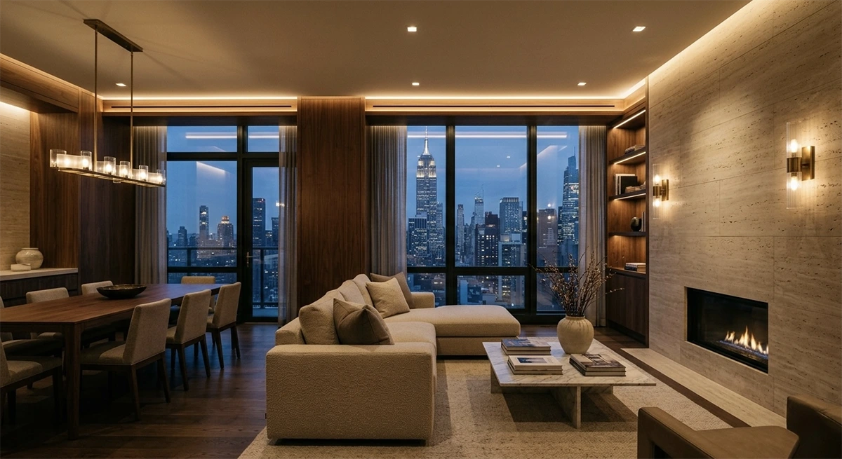
A Final Perspective: Light as Narrative
Lighting defines how a space is experienced over time.
Morning light entering through sheer curtains, layered with low-intensity cove illumination, produces calm. Evening scenes with reduced ambient and heightened accent create intimacy. Entertaining scenes emphasize sparkle and focal brightness. Late-night circulation scenes guide movement without disturbing rest.
Architecture is static. Light is temporal.
When lighting is treated as a core architectural material, specified with photometric discipline, integrated with millwork and systems, and programmed with intentional scenes, it elevates modest square footage into spatial richness.
In dense urban markets where altering structure is costly and regulated, lighting remains the most agile design instrument available.
Best Color Combinations for a Bathroom Renovation in NYC (2026 Trends)
Color is the decision that costs the least to make and the most to get wrong. In a bathroom renovati

The Rise of Sustainable Renovation: A Guide to Eco-Friendly Upgrades
Something has shifted in how Manhattan homeowners think about renovation. Environmental responsibili
The Secret Life of Light: How Lighting Can Make or Break a Room
There is a particular kind of room that photographs beautifully and feels wrong the moment you step