
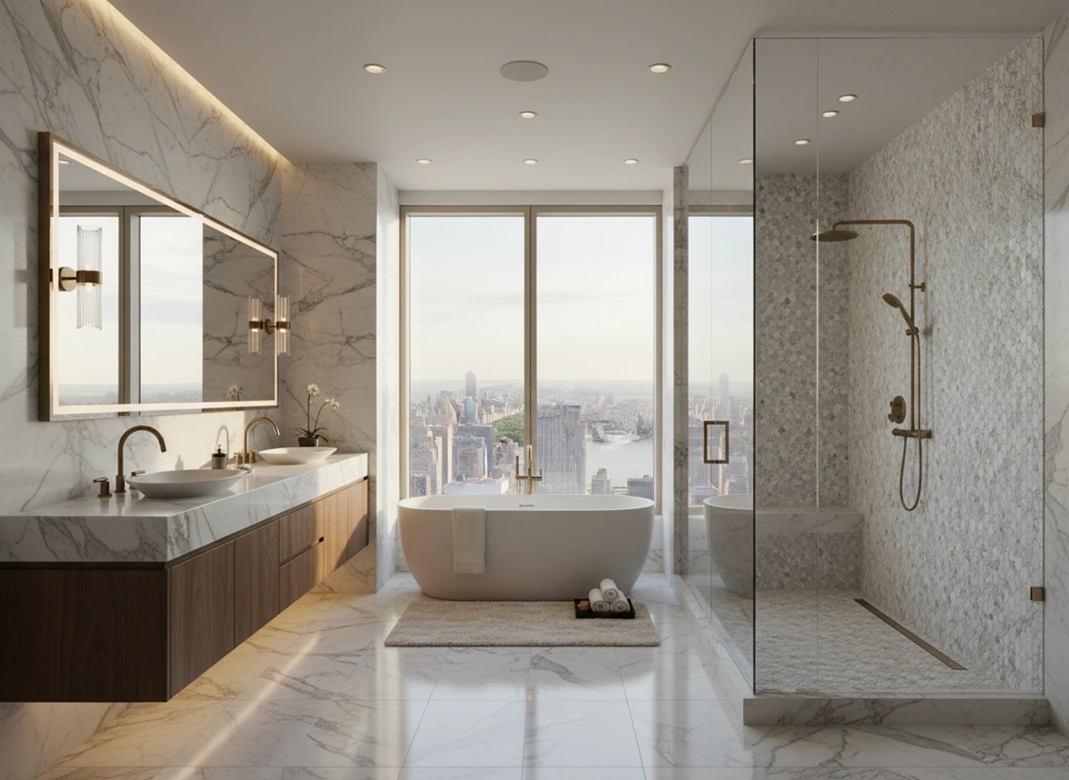
The Ultimate Guide to Bathroom Tile Design: Ideas for Walls, Floors, and Showers
Tile is one of the design choices that stays with a bathroom for a very long time. Paint gets repainted, hardware gets swapped, vanities get replaced. Tile is different. It sets the room’s scale, controls reflections, hides or exposes imperfections, and has to perform in a constantly wet environment. Get it wrong and the room feels off regardless of how beautiful the fixtures are. Get it right and the bathroom reads as intentional and lasting.
What tile actually does
Tile works on three levels at once. It protects the structure, though it’s worth being precise about that: the tile is the surface, while the waterproofing and substrate beneath it are the systems actually keeping water out of the building. It controls light and texture, since finish, color, and size all change how a room reads under different lighting. And more than any other material, it gives the room its lasting personality and determines how the bathroom ages.
The useful question isn’t what you like. It’s how you want the room to feel, and how the tile will perform over the next decade.
Tile types and where they belong
Ceramic is the affordable, versatile choice, available in endless colors and easy to install, which suits walls, backsplashes, and floors with moderate traffic. Its glaze can chip, and it’s less durable than porcelain.
Porcelain is the workhorse, dense and water-resistant with low maintenance, and it handles high-traffic floors, showers, and wet rooms while convincingly mimicking stone or wood. It costs more and is harder to cut.
Marble brings genuine luxury and unique veining, and it belongs on feature walls, vanity tops, and accent floors. It’s expensive, highly porous, scratches readily, and needs regular sealing.
Glass offers reflectivity and clean, bright color, which works well on backsplashes, accent walls, and shower nooks. It’s costly, tricky to install, and can crack.
Mosaic allows genuinely artistic patterning and suits focus walls, borders, and niche accents. Installation is complex, the grout volume is high, and the cost reflects both.
Cement tiles deliver graphic pattern and a patina that develops with age, working best on floors and feature walls. They’re porous, need sealing, and show wear over time.
Concrete-look porcelain gives an industrial, minimal appearance with real durability, mostly on floors in modern bathrooms, though it never quite reads as actual concrete and can feel cold.
| Tile Type | Best Use | Pros | Cons |
|---|---|---|---|
| Ceramic | Walls, backsplashes, moderate-traffic floors | Affordable, versatile, endless colors | Glaze can chip, less durable than porcelain |
| Porcelain | High-traffic floors, showers, wet rooms | Dense, water-resistant, low maintenance, mimics stone or wood | Costs more, harder to cut |
| Marble | Feature walls, vanity tops, accent floors | Luxury, unique veining | Expensive, highly porous, scratches easily, needs sealing |
| Glass | Backsplashes, accent walls, shower nooks | Reflective, clean bright color | Costly, tricky to install, can crack |
| Mosaic | Focus walls, borders, niche accents | Genuinely artistic patterning | Complex installation, high grout volume, cost |
| Cement Tiles | Floors, feature walls | Graphic pattern, patina develops with age | Porous, needs sealing, shows wear over time |
| Concrete-look Porcelain | Floors in modern bathrooms | Industrial, minimal, durable | Never quite reads as real concrete, can feel cold |
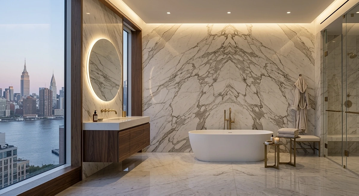
As a working rule, use porcelain or natural stone on floors, porcelain or glazed ceramic on walls, and mosaic for sloped shower floors and accents.
Tile size and how it changes a room
Tile size is a visual lever, and it shifts perceived scale more than almost any other single decision.
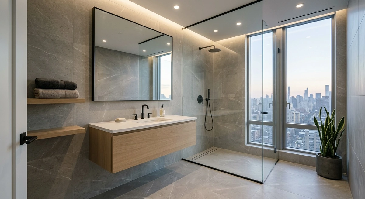
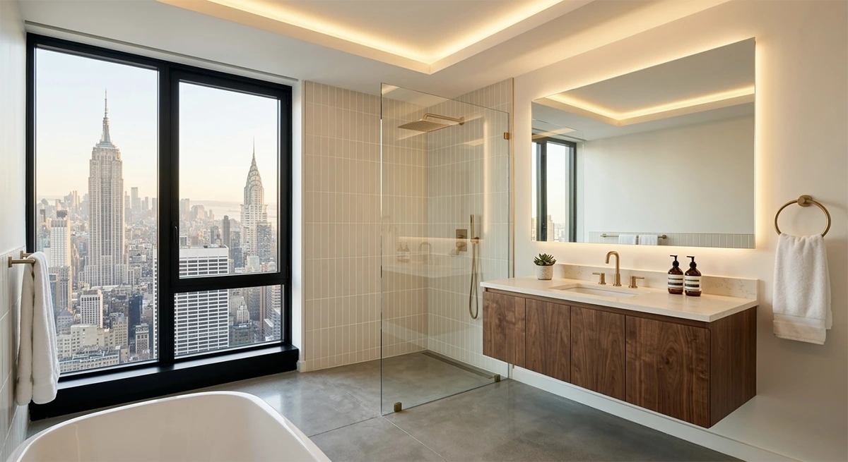
Large format, meaning something like 24 by 48 inches, makes walls read as one continuous plane and strips out visual clutter, which is why it works so well in narrow bathrooms and on shower walls. Medium sizes around 12 by 24 inches are the balanced choice that suits most layouts, on both floors and walls. Subway tile, whether the classic 3 by 6 or an elongated version, behaves differently depending on orientation: stacked vertically it lifts the ceiling, while a horizontal layout widens the room. Small mosaic in the one to two inch range adds rhythm and texture, though it fragments a space if used across too much of it, which is why it belongs on shower floors, in decorative bands, and inside niches.
| Tile Size | Effect on Space | Best Application |
|---|---|---|
| Large format (24×48″) | Makes walls read as one continuous plane, reduces visual clutter | Narrow bathrooms, shower walls |
| Medium (12×24″) | Balanced, works in most layouts | Floors and walls |
| Subway (3×6″ or elongated) | Vertical stack lifts the ceiling; horizontal layout widens the room | Walls, shower surrounds |
| Small mosaic (1-2″) | Adds rhythm and texture, fragments space if overused | Shower floors, decorative bands, niches |
Layout patterns
The offset or running bond pattern is the familiar brick-like stagger, with each row shifted by half a tile. It’s classic, linear, and versatile enough for floors, large wall areas, and backsplashes.
Herringbone lays rectangular tiles at forty-five degrees to form a V, and it reads elegant and dynamic while visually expanding a space, which makes it a strong choice for entire shower walls, feature walls, and floors.
Chevron uses angle-cut tiles meeting at a continuous point, producing something more sophisticated and highly directional. It creates a real focal point on luxury feature walls and feature shower floors.
Basketweave alternates pairs of rectangular tiles to suggest woven fabric, and its traditional charm suits vintage spaces, small floor accents, and decorative borders.
Stacked bond aligns tiles in direct rows with no offset at all, producing an ultra-minimal geometric result. Run horizontally it emphasizes width and vertically it emphasizes height, and it works on walls and minimal floors alike.
Linear mosaic uses elongated narrow strips in continuous flow, giving a sleek modern directionality that suits shower floors, accent strips, and backsplashes.
Hexagon tile builds a repeating honeycomb that manages to be both playful and classic, and it works across bathroom floors, feature walls, or entire rooms.
| Pattern | Best Location | Visual Effect |
|---|---|---|
| Offset (Running Bond) | Floors, large wall areas, backsplashes | Classic, linear, versatile |
| Herringbone | Entire shower walls, feature walls, floors | Elegant, dynamic, visually expands the space |
| Chevron | Luxury feature walls, feature shower floors | Sophisticated, highly directional, creates a focal point |
| Basketweave | Vintage spaces, small floor accents, decorative borders | Traditional charm |
| Stacked Bond | Walls, minimal floors | Ultra-minimal, geometric; horizontal emphasizes width, vertical emphasizes height |
| Linear Mosaic | Shower floors, accent strips, backsplashes | Sleek, modern, directional |
| Hexagon | Bathroom floors, feature walls, entire rooms | Playful yet classic |
Color, texture, and grout
Finish changes everything about how a tile behaves. Glossy reflects light and helps a small shower feel brighter, at the cost of showing every water mark. Matte reduces glare, feels more tactile, and hides smudges well. Textured adds visual richness and provides genuine grip underfoot.
Grout is a smaller decision with outsized consequences. Matching grout gives a seamless, pared-back look, while contrasting grout emphasizes geometry and suits graphic patterns. Epoxy grout resists staining and mold considerably better than standard cementitious grout, though it’s harder to work with and costs more.
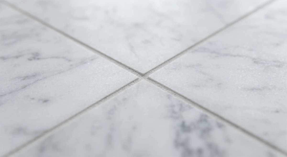
One warning about undertone. A white tile with a blue undertone looks completely different under warm light than a warm white does. Bring large samples into the actual bathroom and check them in both morning and evening light before committing.
Safety and performance ratings
Two numbers matter when you’re specifying tile. Slip resistance is measured by coefficient of friction, and for shower floors and wet areas you want a tile rated for wet conditions rather than a general-purpose one. Wear resistance uses the PEI scale, where PEI 3 to 4 is adequate for residential bathroom floors and PEI 5 is aimed at entryways and heavy-use commercial areas.
Slip resistance standards deserve a note, because the numbers get quoted loosely. The industry standard used today for tile in wet interior areas is the dynamic coefficient of friction test under ANSI A137.1, with a commonly specified threshold of 0.42 for level interior spaces expected to be walked on when wet. An older static COF figure of 0.6 also circulates widely and appears in accessibility guidance, which is why you’ll see both numbers cited. Rather than relying on a single remembered figure, ask your supplier for the tile’s actual DCOF rating and confirm with your contractor or architect which standard applies to your specific project, since requirements differ between residential and commercial work and get interpreted through the current code edition.
| Rating | What It Measures | What to Look For |
|---|---|---|
| Slip Resistance (DCOF / COF) | Slip resistance on wet surfaces | Rated for wet conditions; DCOF of at least 0.42 under ANSI A137.1 for shower floors and wet areas |
| PEI 3-4 | Wear resistance for residential floors | Adequate for residential bathroom floors |
| PEI 5 | High-traffic wear | Entryways and heavy-use commercial areas |
Waterproofing and substrate
Tile and grout are durable finishes, not waterproofing systems. The membrane beneath them is what protects your floor and framing.
Modern shower installations rely on a bonded waterproof membrane or a factory sheet system tied properly into a clamped drain, with a pre-sloped mortar bed ensuring the finished floor actually drains. The substrate has to be genuinely flat, since large tiles demand a level base and uneven framing produces cracks. Flood testing, where the drain is temporarily sealed and the pan filled before tile goes down, is a small step with enormous upside. Ask for it explicitly, and ask for the results to be documented.
Substrate flatness deserves particular attention in a Manhattan pre-war building. Wood-framed floors of that era routinely have natural deflection and settling after a century of use, and a floor that looks fine to the eye can be well out of tolerance for large-format tile. The practical consequence is that pre-war bathrooms frequently need self-leveling compound or additional substrate work before large tile can be installed safely, and where deflection is significant, a structural assessment may be warranted before committing to a large-format specification. This is a cost that belongs in the budget from the start, and it’s one reason experienced New York contractors survey the floor before finalizing tile selection rather than after.
Movement joints and edge details
Tile assemblies have to accommodate building movement, and this is a structural requirement rather than a cosmetic preference, since without it you get random cracking.
Movement joints are required at prescribed intervals, and they matter most with large-format tile and long wall runs. Perimeter joints where tile meets a different material need to be sealed and trimmed with appropriate profiles, and metal edge trims create clean transitions but must allow for expansion so they don’t buckle over time.
Worth knowing in New York: movement joint requirements are code requirements, not installer preferences. Omitting them is a genuine compliance issue that can surface during inspection on permitted work, quite apart from the cracked tile it eventually produces. If an installer treats movement joints as optional or as something that spoils the look, that’s a meaningful signal about the rest of their work.
Installation quality
Lippage, the height difference between adjacent tiles, becomes immediately visible with large-format tile and undermines an expensive material instantly. Leveling clips and genuine supervision are what keep it under control.
Layout planning separates a competent installer from an adequate one. A good installer dry lays the design before committing anything, because centering a tile run on the vanity or aligning a feature at eye height meaningfully changes where the room’s focal points land. In open configurations, it’s worth considering where the eye falls from several angles before the final placement is set.
Maintenance and long-term care
Match your cleaners to the tile and grout type, since the wrong product damages natural stone permanently. Porous natural stone needs resealing at whatever interval the manufacturer specifies.
Keep leftover tile from the project, because a broken floor tile a decade from now is far easier to replace with a spare from the original batch than with a new order that won’t match the shade. In a co-op or condo, check your building’s rules before deciding where those boxes live, since many buildings restrict storing construction materials in common areas, basements, and storage rooms, and some prohibit it outright. A few spare tiles in a closet inside the unit is usually the practical answer.
What endures and what dates
Large-format porcelain in stone looks tends to age well, as does elongated subway in a vertical stack, textured tile that shifts with the light, and a restrained accent confined to a niche or a single wall.
What dates quickly is loud patterned flooring running throughout, heavily themed decorative tile used everywhere, highly saturated color across every surface, and statement tile deployed as both the primary floor and wall material.
| Timeless | Trends That Date Quickly |
|---|---|
| Large-format porcelain in stone looks | Loud patterned flooring running throughout |
| Elongated subway in a vertical stack | Heavily themed decorative tile used everywhere |
| Textured tile that shifts with the light | Highly saturated color across every surface |
| Restrained accent confined to a niche or single wall | Statement tile as both primary floor and wall material |
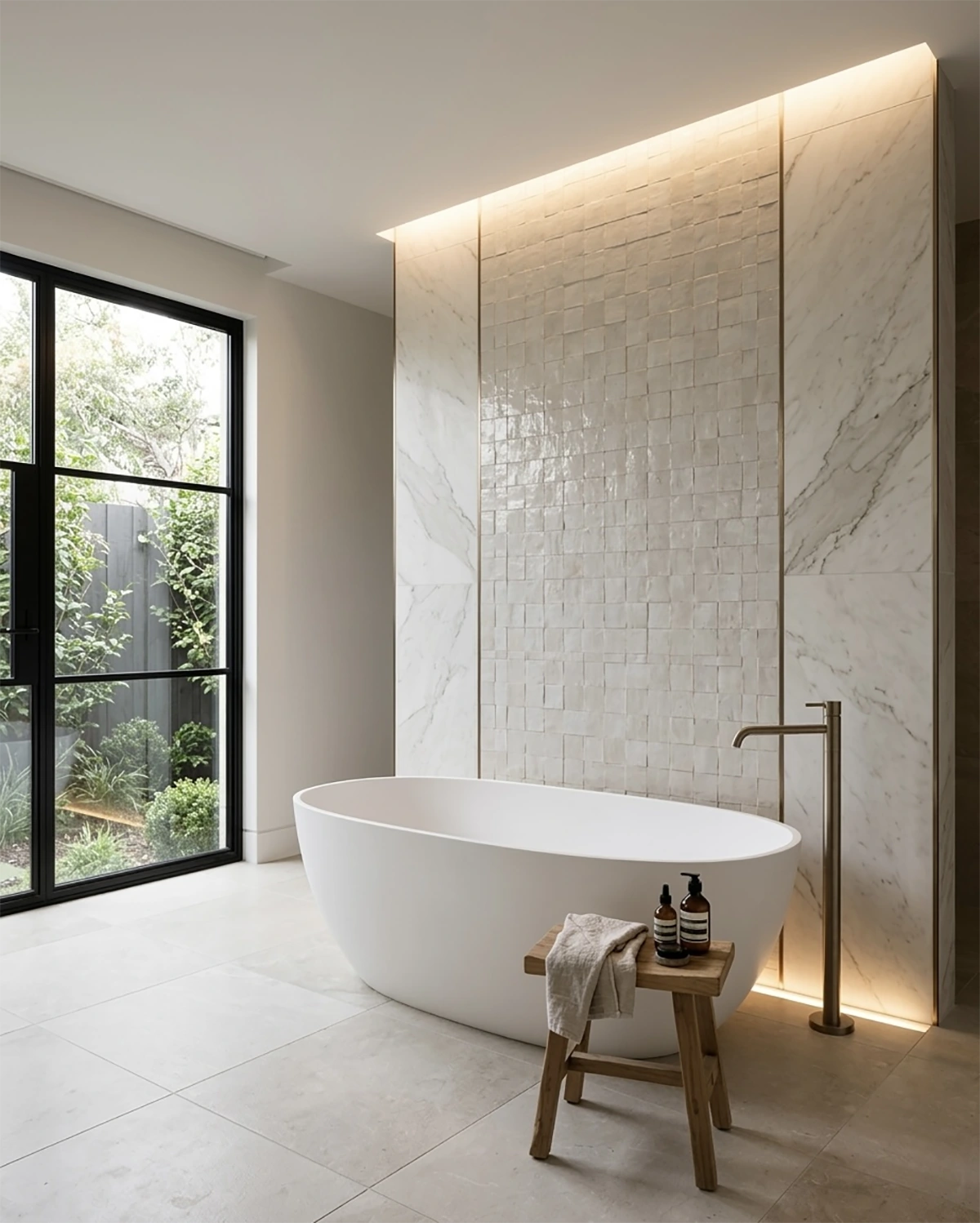
For Manhattan resale specifically, restrained textures, durable materials, and layouts that read as architectural rather than purely decorative hold their value best. Save the statements for a niche or a single wall.
Making the final call
Work through three decisions in order. Decide first how you want the room to feel, whether that’s seamless and expansive, warm and tactile, or dramatic and intimate. Then choose materials and finishes that deliver that feeling while genuinely meeting the technical requirements for wet areas. Finally, insist on proper substrate work and a clear waterproofing strategy before a single tile goes down.
Tile is effectively permanent, so treat it as architecture. Choose with intent, test on site, and require professional installation.

When Space Tells a Story: Designing Homes with Character, Not Just Style
There’s a specific feeling you get walking into certain homes, an immediate sense that someone
Your Bedroom Has the Wrong Energy
On a gut renovation in Yorkville, the couple kept the bed under a window and both said they woke up
Best Color Combinations for a Bathroom Renovation in NYC (2026 Trends)
Color is the cheapest decision in a bathroom renovation and the most expensive one to get wrong. Eve