
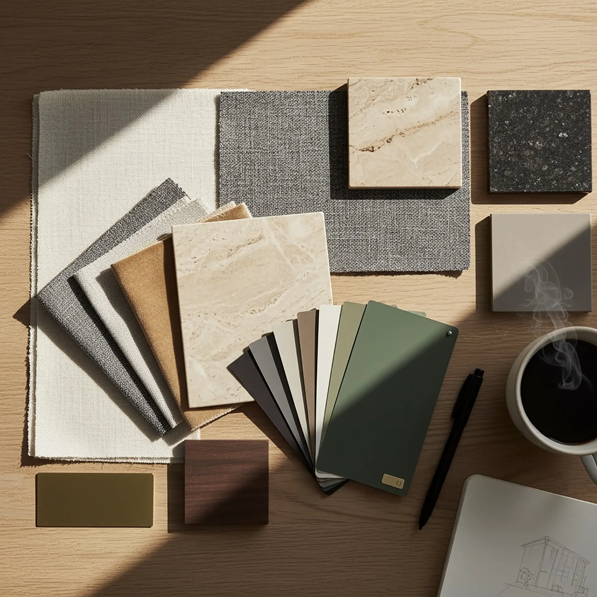
The Manhattan Palette: Timeless Color Combinations for Urban Interiors
Manhattan has always been a canvas for design: a vertical gallery of glass, steel, and stone that reflects every era’s obsession with style. From the soft limestone façades of pre-war buildings to the inky reflections of modern towers, the city itself is a lesson in color harmony.
Inside its apartments, this balance continues. Muted neutrals meet bold accents, warm undertones soften industrial edges, and daylight paints walls with hues that change through the day.
Call it the Manhattan Palette: a color philosophy built on timeless contrasts, urban textures, and emotional depth.
Why color behaves differently in the city
Color never exists in isolation. It interacts with light, scale, and context, and in Manhattan that context is specific:
- Natural light arrives filtered through neighboring buildings and reflected off glass
- Interiors are often compact, which puts pressure on tones to expand a space visually
- Materials like steel, brick, and concrete change how colors read against them
The result is that urban interiors lean on tonal balance rather than boldness. Subtle shifts in hue do more work than strong statements, because the light is already doing something unpredictable to whatever you put on the wall. Composition matters more than any individual color: like a skyline, a palette has to hold light and shadow, calm and energy, at the same time.
The anatomy of the Manhattan Palette
These are the combinations that have shaped New York’s most durable interiors. None of them are trends.
| Color Combination | Key Elements | Mood and Style | Best For |
|---|---|---|---|
| Warm Neutrals + Charcoal Accents | Taupe walls, oak floors, black steel frames | Industrial warmth with defined structure | Lofts, modern apartments |
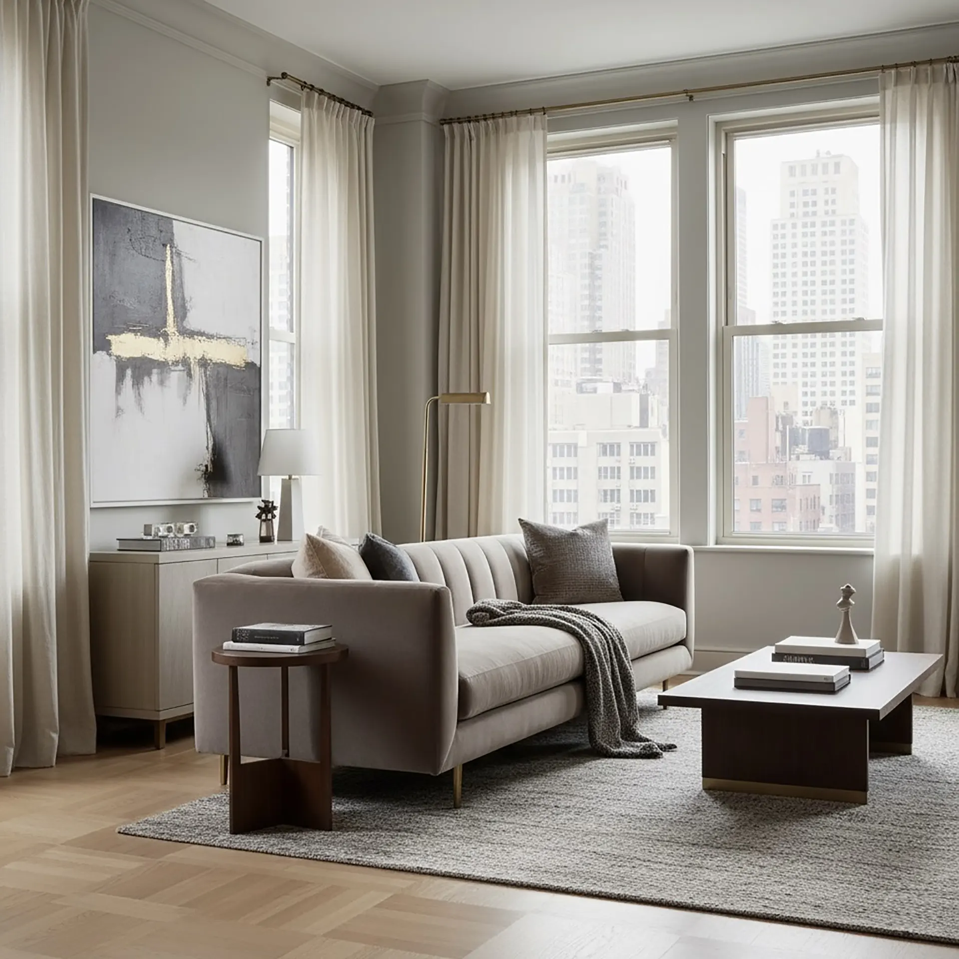
| Greige + Ivory + Graphite | Grey-beige mix, ivory highlights, dark grey accents | Refined, architectural | Open-plan apartments, penthouses |
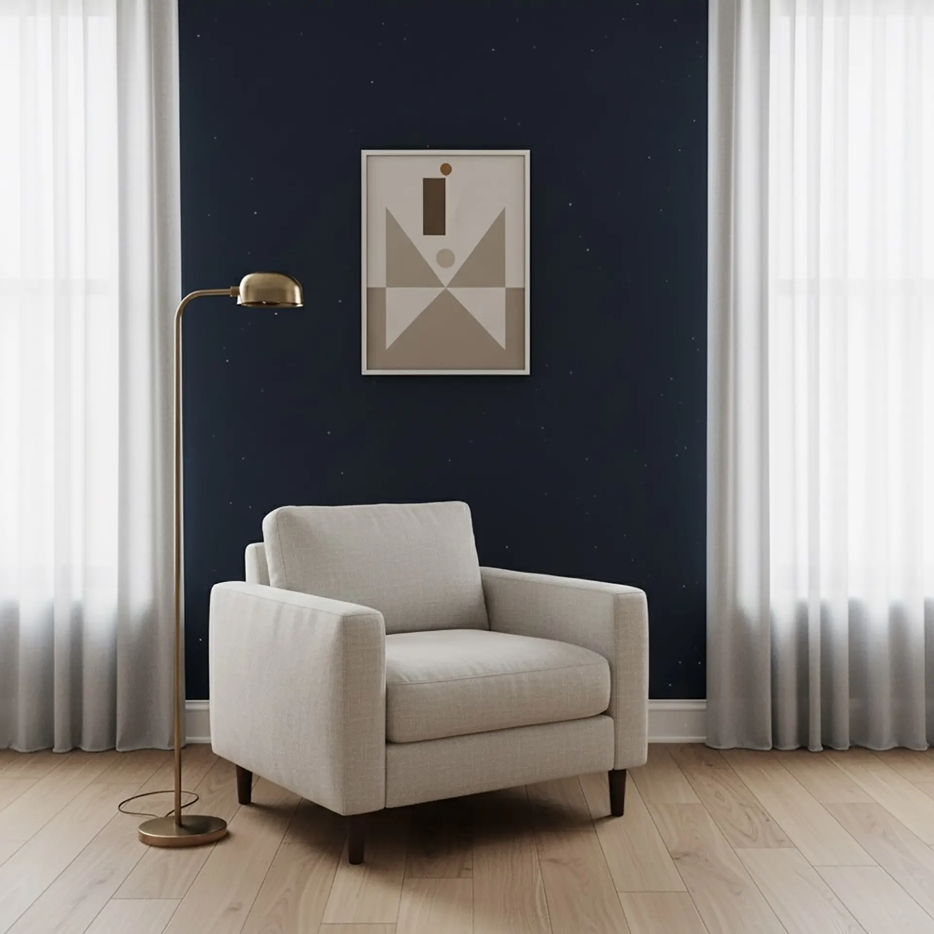
| Stone White + Midnight Blue | Stone white base, deep blue accents | Calm sophistication, Hudson-inspired depth | Art-forward lofts, brownstone interiors |
| Camel + Concrete + Black | Camel tones, concrete grey, black drama | Earthy, grounded, urban | Contemporary spaces, industrial conversions |
| White-on-White | Matte walls, silk curtains, limestone finishes | Light, expansive, dimensional | Compact apartments, minimalist spaces |
Warm neutrals with charcoal accents
Taupe walls, oak floors, black steel frames. The warmth keeps the industrial edge from turning cold, while the dark accents define structure. Warm neutrals have quietly replaced white as the default base in this market, because they ground a room without flattening it.
Greige, ivory, and graphite
This trio reads as modern Manhattan. The grey-beige mix softens incoming light, ivory keeps the room bright, and graphite gives the eye somewhere to land. It works particularly well in open-plan apartments where one palette has to carry several functions.
Stone white with midnight blue
Blue carries the depth of the river and the color of the city at dusk. Against stone white it produces calm without coldness, which is why it recurs in art-forward lofts and in brownstone interiors where the architecture is already doing a lot of talking.
Camel, concrete, and black
Camel brings warmth, concrete keeps it grounded, black supplies the drama. The lesson inside this combination applies broadly: a monochrome scheme tends toward sterile, and introducing a single organic tone changes the whole atmosphere of the room.
White on white, done properly
Layering whites with texture rather than color — matte plaster, silk, limestone — creates dimension out of a single hue. In a compact apartment it is often the most effective way to amplify what daylight you have.
Why the city pulls toward muted palettes
New Yorkers tend toward tonal depth rather than vibrancy, and the reason is straightforward: in a city that doesn’t stop, the apartment has to supply what the street cannot.
Beige, greige, and soft taupe echo sand, stone, and earth, and they give the eye somewhere neutral to rest after a day of visual noise. Dark tones do something different but related: used deliberately, charcoal and espresso produce a sense of enclosure that reads as refuge rather than gloom.
Interior designer Tatiana Chechina works this balance by pairing light oak and cream against charcoal or espresso cabinetry, which lets a compact apartment stay bright while still having weight to it. Her rule of thumb is that the dark tone should be something you can walk toward, not something that surrounds you: one anchoring surface, not four walls.
Composing color like music
Color works on rhythm and contrast. Too much similarity and the room goes flat; too much contrast and it goes noisy. The approach that holds up:
- Anchor the room with one deep tone — charcoal, navy, espresso — to define structure
- Layer neutrals such as linen, mushroom, or warm white across walls and furniture
- Introduce texture instead of pattern: plaster, rattan, stone, and wool build richness without visual clutter
- Watch light temperature. Warm bulbs push grey toward gold; cooler light sharpens modern edges. The same paint will not read the same under both
- Use greenery sparingly. One plant or an olive tree supplies organic contrast; a room full of them supplies noise
The fourth point is the one people skip and then blame the paint for. Test a sample on the actual wall, under the actual fixtures, at the hour you most use the room.
Where your color choices stop being yours
Inside your apartment, the palette is entirely your decision. Two places it isn’t, and both catch owners out.
The first is your entry door. It faces a common corridor, which usually makes it a common element rather than part of your unit, and a number of Manhattan co-ops require board approval before a shareholder repaints it. Some specify the finish and color outright to keep the hallway consistent. Ask before you buy paint for it.
The second applies if your building sits in a historic district. Much of the West Village falls within the Greenwich Village Historic District, and there the Landmarks Preservation Commission has jurisdiction over the exterior: façade, windows, and the front door of a townhouse. The commission does not regulate the inside of an apartment, so your interior palette is unaffected, but anything visible from the street needs LPC approval before a DOB permit can be issued. Owners planning to repaint a brownstone façade or swap window frames should establish that early, since it changes both the timeline and the range of options.
Why restraint lasts
Quiet palettes endure because they let materials, light, and proportion do the work. They age well precisely because they aren’t making a statement that can go out of date.
That is not an argument for beige walls and safe choices. It is an argument for building the harmony between light, texture, and mood first, so that whatever style you put on top of it — restrained or bold — has something solid underneath. Whether it’s a downtown loft or an Upper West Side townhouse, that is what makes a room feel settled the moment you walk in.
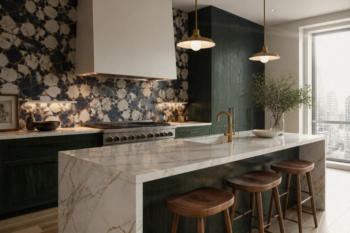
Kitchen Backsplash Design: Materials, Patterns, and What to Skip
Backsplash is one of the last decisions in a kitchen renovation and one of the hardest to reverse. I
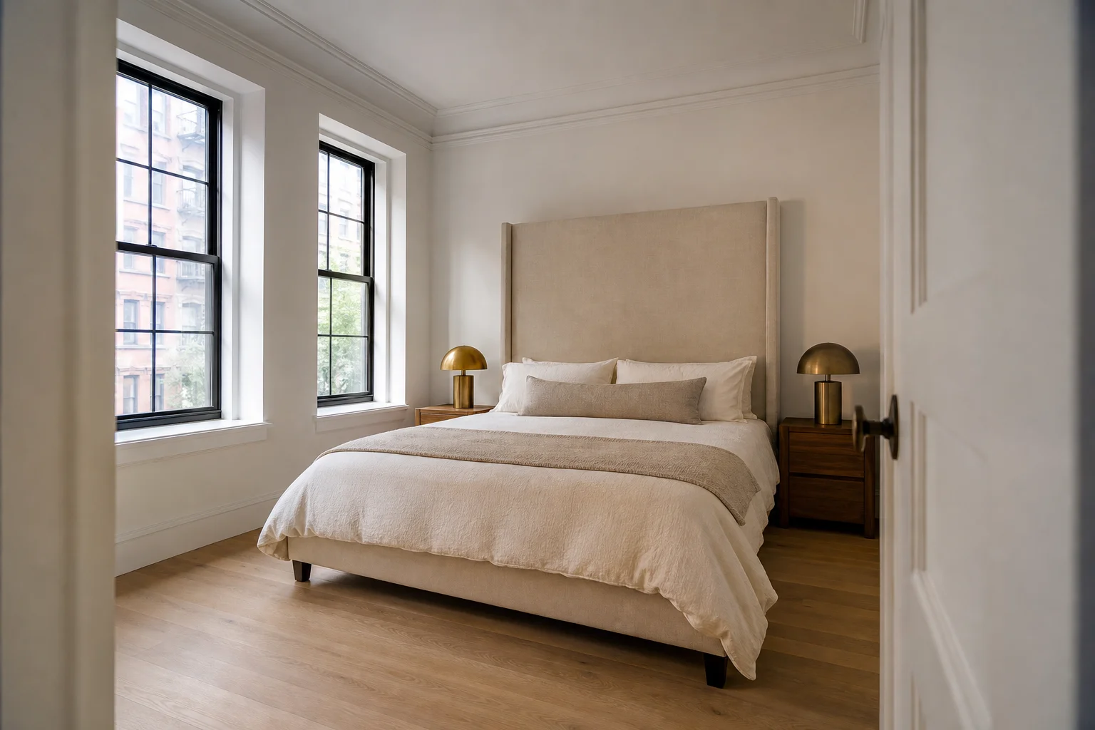
Your Bedroom Has the Wrong Energy
On a gut renovation in Yorkville, the couple kept the bed under a window and both said they woke up
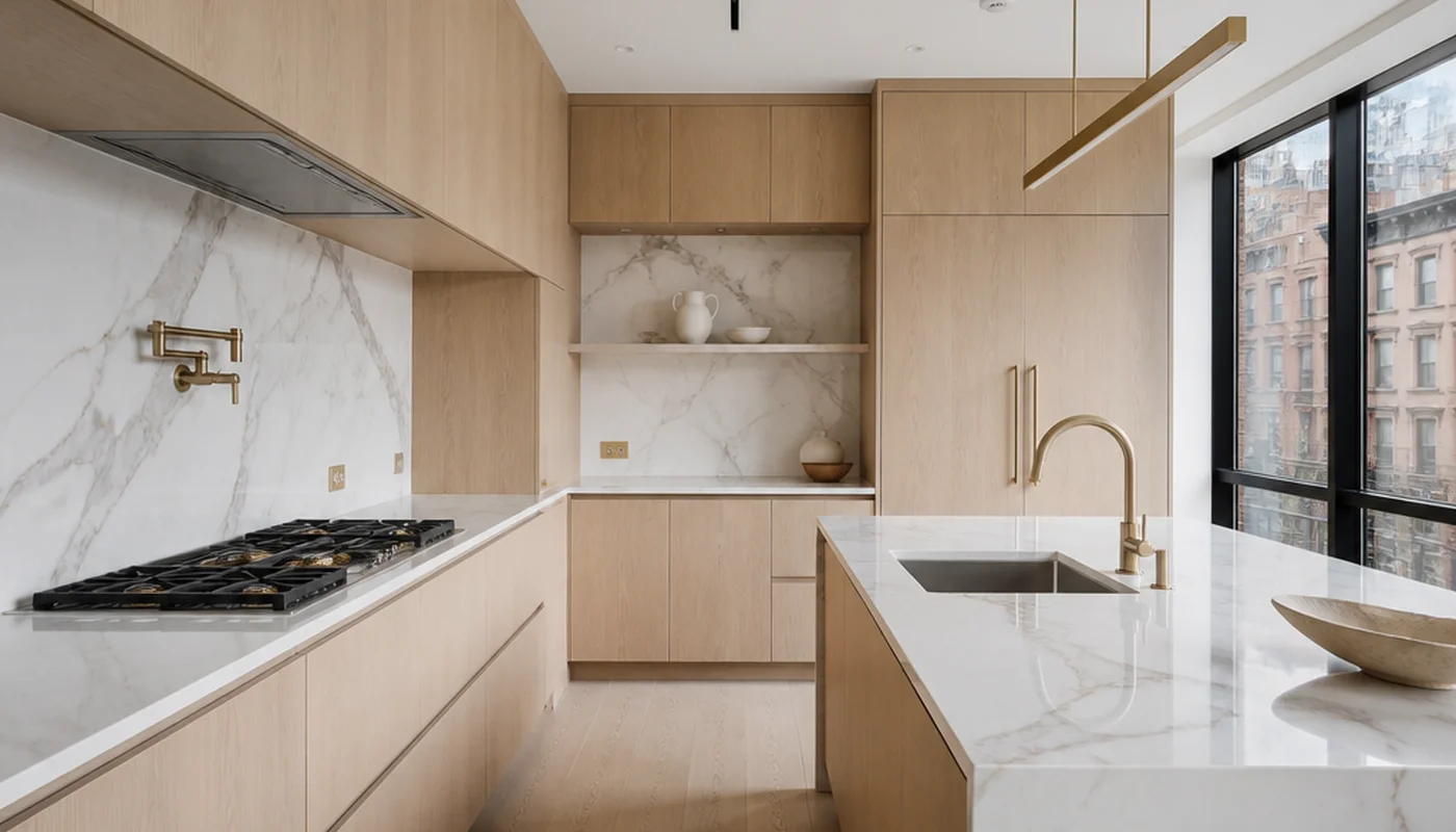
Kitchen Layouts: U-Shape, L-Shape, Galley, and Open Concept
The layout of a kitchen decides everything that follows: where plumbing goes, how the workflow moves