

Color Psychology in Home Design: Painting Your Way to a Happier Home
Color is one of the most underestimated tools in interior design. Most people treat paint as a finishing decision, something to sort out after the layout is resolved and the furniture is chosen. But the colors you live with every day affect your mood, your energy, and your ability to focus or unwind. Understanding what different shades actually do allows for more deliberate choices, and in a Manhattan apartment where every decision is amplified by limited square footage, that matters.
Every shade carries its own psychological fingerprint, capable of influencing mood and affecting physical responses like heart rate and blood pressure. The most successful interiors combine visual appeal with emotional intelligence — using color strategically to enhance productivity in workspaces, promote relaxation in bedrooms, and encourage connection in social areas.
1. Warm Colors for Energy and Connection
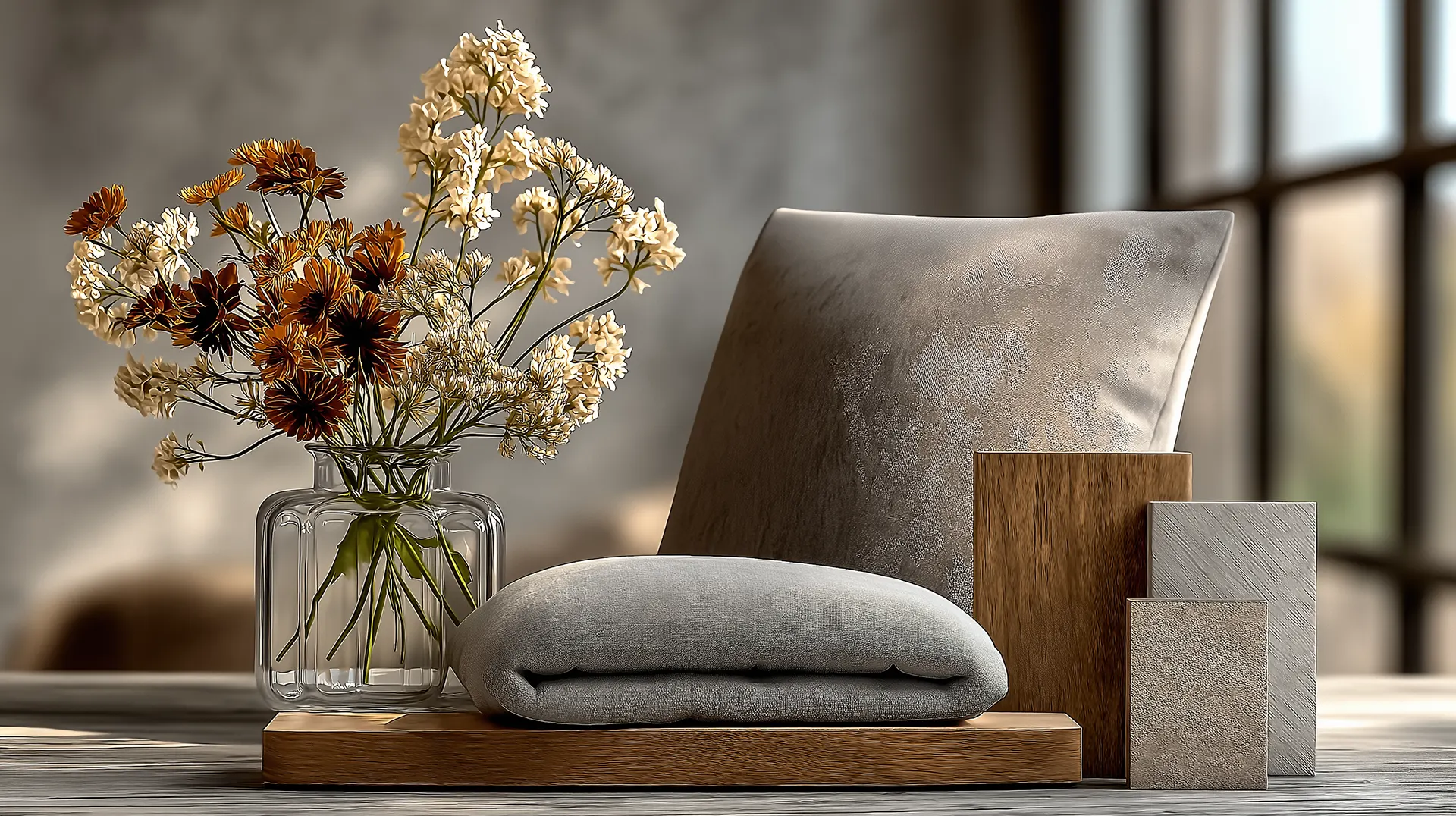
Red, orange, and yellow raise energy levels, encourage conversation, and make spaces feel alive. They’ve been used in dining rooms and gathering spaces across cultures for centuries because they work.
Red is the most intense of the group. As a dominant wall color it can feel oppressive fairly quickly, but as an accent in artwork, upholstery, or a single dining room wall, it adds warmth without taking over. Orange is easier to live with at scale — it feels energetic without being aggressive, which makes it a natural fit for kitchens and family rooms. Yellow in its softer forms, the tones closer to butter or warm cream, promotes clarity and optimism. Saturated yellows are harder to live with over time, and most Manhattan interiors use them sparingly.
Many Manhattan home designs incorporate these warm tones as accents rather than primary walls — a terracotta sofa against a warm white wall, a rust accent chair in a neutral living room, a kitchen island in muted ochre. These choices bring warmth into a space without committing a room to a single temperature.
2. Cool Colors for Calm and Focus
Blue, green, and purple reduce perceived stress and create conditions for rest and focus. This is why they tend to dominate bedrooms, home offices, and bathrooms.
Blue is calming in a way that’s been documented consistently across research. Soft blues and muted slate tones work well in bedrooms because they’re quiet and undemanding. Deep navy reads more enveloping and dramatic, but shares the same underlying quality of being easy on the nervous system.
Green is useful because its character shifts depending on undertone. Sage, eucalyptus, and olive feel grounded and organic – they reduce eye strain in spaces where people spend long stretches of time, which makes them good choices for home offices and reading rooms. Deeper purples – eggplant, plum – add a sense of richness and creative weight. Lavender and dusty mauve are closer to the softer blues in effect: calm without coldness.
When working with any licensed home improvement in New York, these cooler shades often form a calm foundation, allowing homeowners to layer trendier accents without overwhelming the space.
3. Neutrals for Timeless Versatility
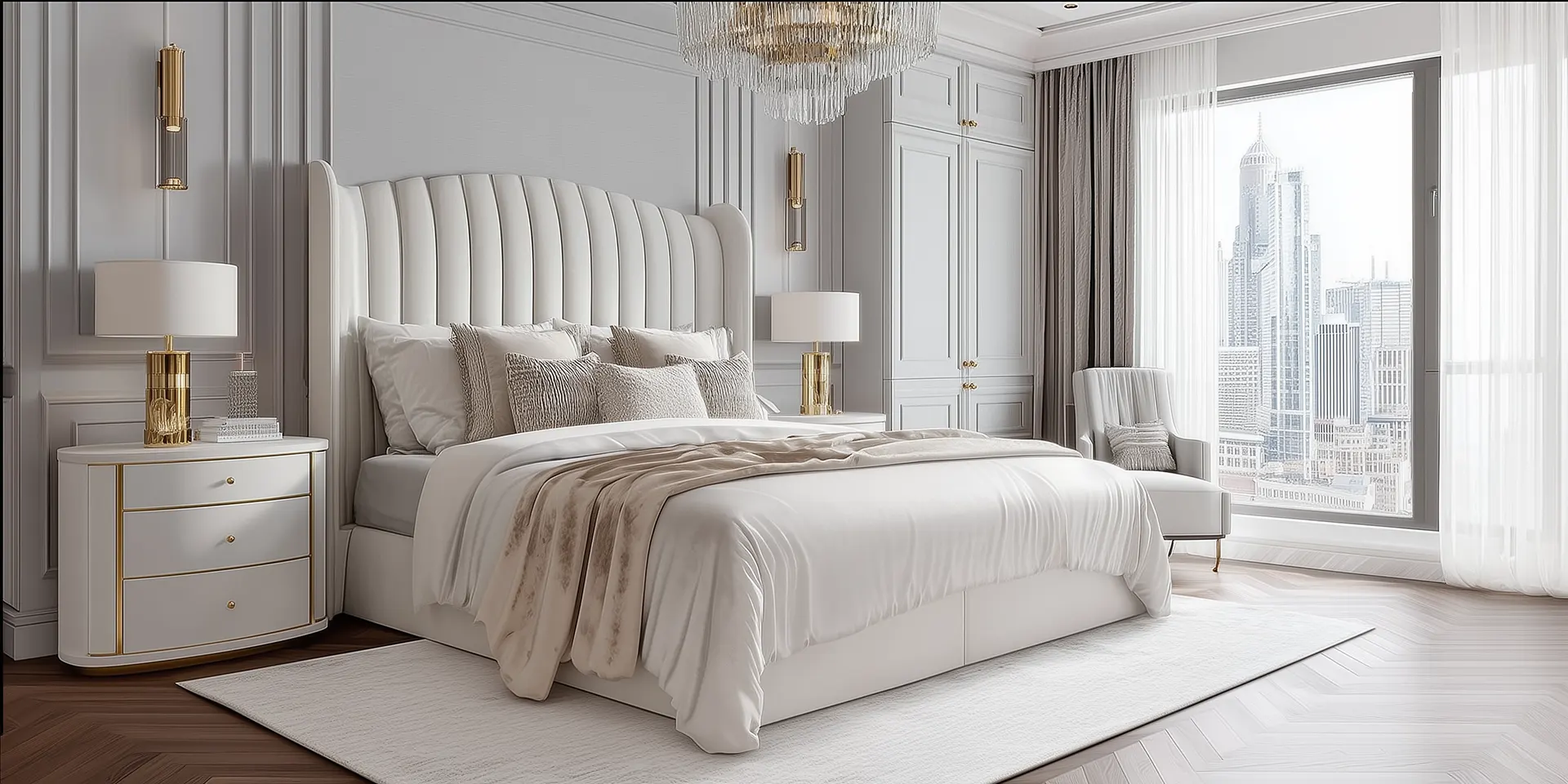
The best neutral interiors in New York are built on a neutral base because it lets the architecture, materials, and light show clearly. It’s a considered choice, not a cautious one.
Warm neutrals — cream, taupe, greige — feel comfortable and inhabited. Cool neutrals — dove gray, pale stone, soft white — feel more contemporary and crisp. The difference between them matters more than most people expect. A warm neutral in a north-facing Manhattan apartment creates a completely different room than a cool neutral in the same space, and neither is universally right. It depends on the light and the materials already present.
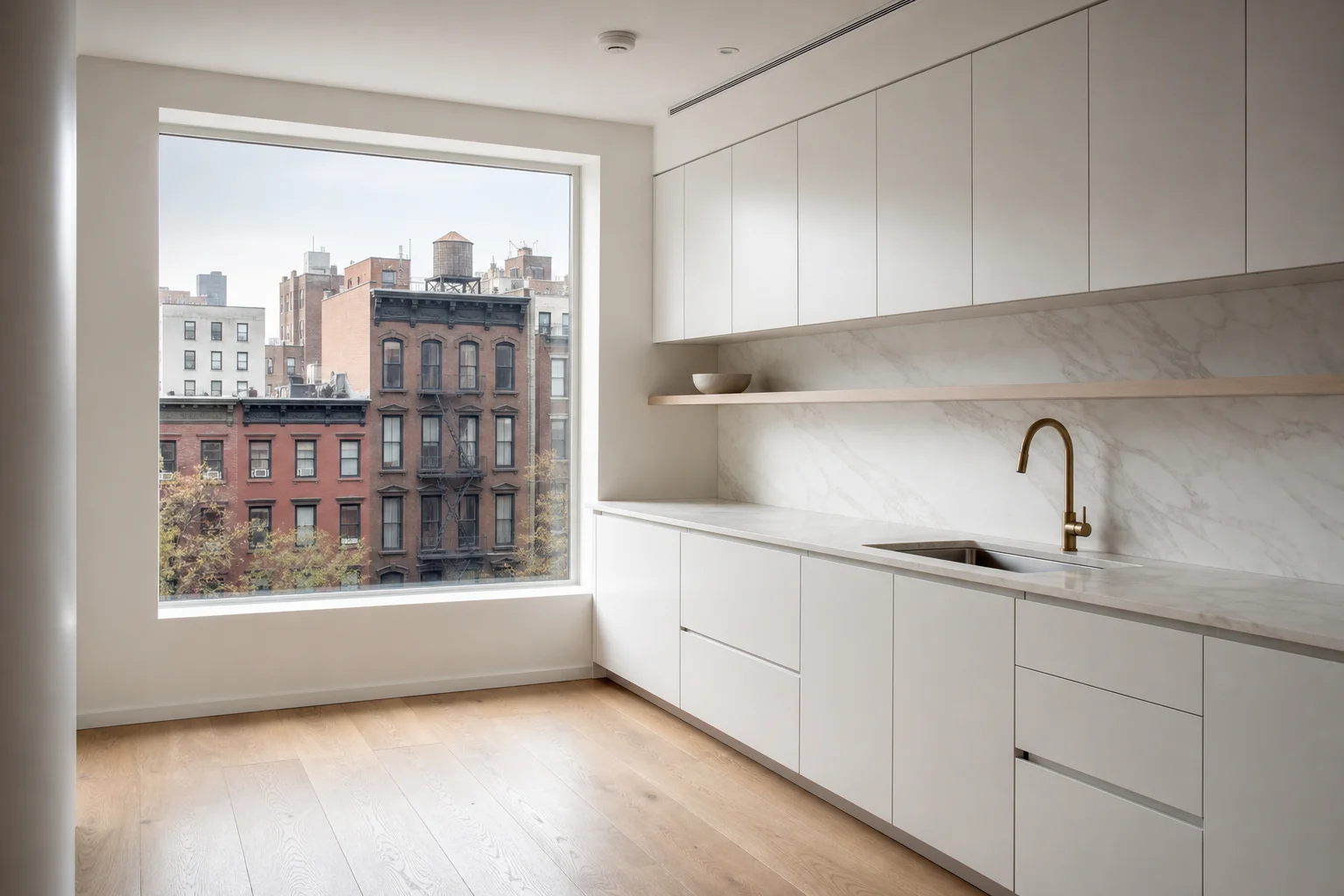
In a luxury big kitchen design, layering neutral tones and textures prevents the space from feeling flat, ensuring the relationship between wall color, cabinet finish, countertop, and backsplash is an exercise in managing subtle shifts within a restrained range. Done with attention to undertone and texture, it produces a space that feels resolved.
The practical case for a neutral foundation is longevity. A room built on a well-chosen neutral absorbs changes in furniture and textiles over years without needing a full repaint. In a co-op where painting involves board approval and real preparation, that durability is worth something.
4. How It Works Across a Whole Apartment
The most effective color schemes use different temperatures in different zones. Warm tones in social spaces, cooler tones in bedrooms and offices, neutrals connecting everything across hallways and transitions. In smaller Manhattan apartments where rooms open directly into each other, this continuity matters. The color visible through an open doorway is part of the room you’re standing in.
The other variable that changes everything is light. A color that looks right in a south-facing room with afternoon sun will look completely different in a north-facing room under artificial light. Test large painted samples on the actual wall at different times of day before committing. Paint chips are essentially useless for this purpose.
Color Psychology Quick Guide:
| Color Family | Effect | Best Used In | Manhattan Tip |
|---|---|---|---|
| Warm (Red, Orange, Yellow) | Raises energy, encourages conversation | Kitchens, dining rooms, family rooms | Use as accents — terracotta, rust, ochre — rather than primary walls |
| Cool (Blue, Green, Purple) | Reduces stress, supports rest and focus | Bedrooms, home offices, bathrooms | Sage and olive reduce eye strain — ideal for long stretches in small spaces |
| Neutral (Cream, Gray, White) | Lets architecture and light read clearly | All rooms, transitions, hallways | Warm vs cool undertone matters — test on the actual wall at different times of day |
Kitchen Cabinet Colors: White, Gray, Wood, and Bold for Manhattan Kitchens
The cabinet color decision locks in every other material downstream. In the Manhattan kitchens we
The Manhattan Palette: Timeless Color Combinations for Urban Interiors
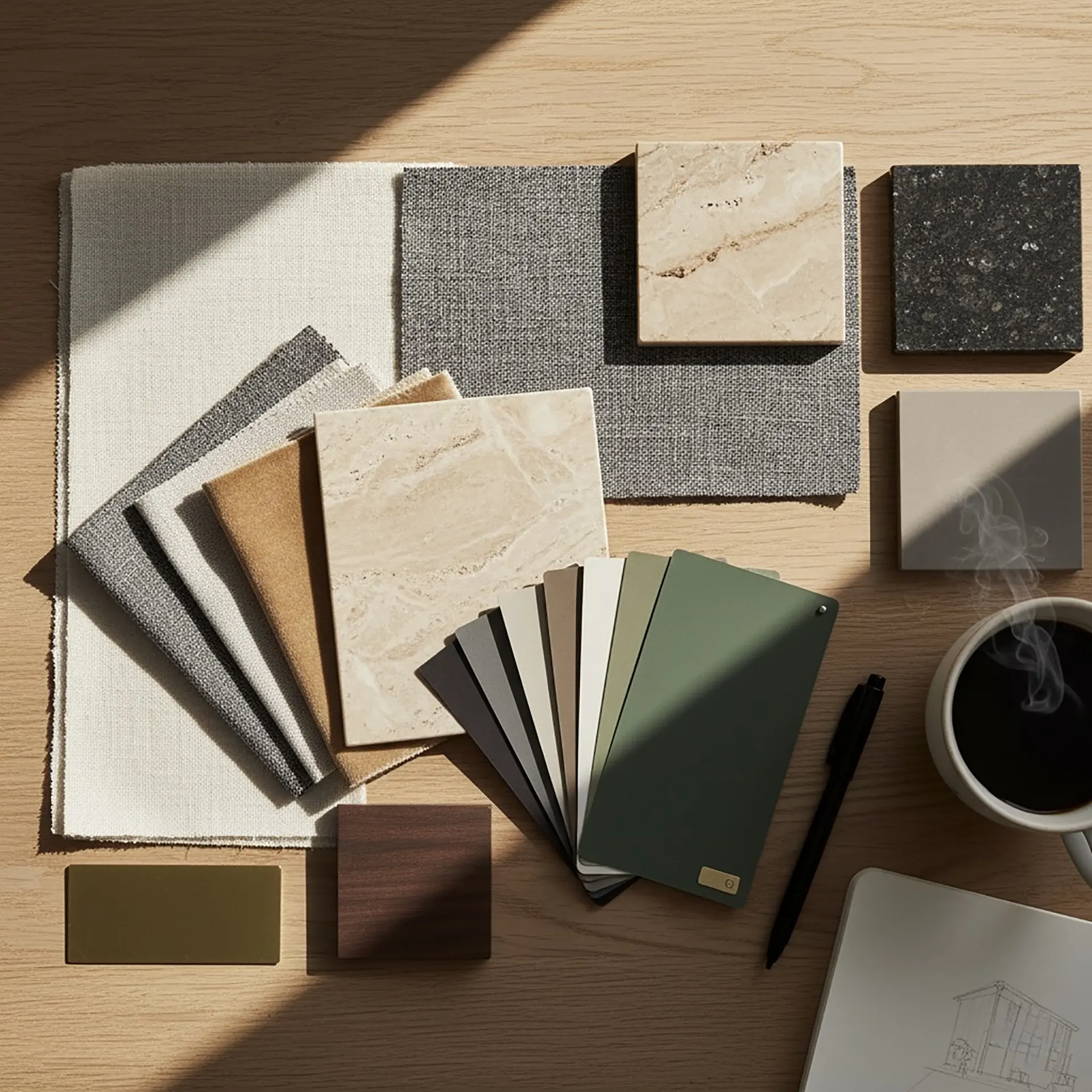
Manhattan has always been a canvas for design: a vertical gallery of glass, steel, and stone that re

The Architecture of Emotion: Designing Homes That Make You Feel Something
What if a room could shape how you feel, not just how it looks? Imagine a living room that helps you