Best Color Combinations for a Bathroom Renovation in NYC (2026 Trends)
Color is the decision that costs the least to make and the most to get wrong. In a bathroom renovation, every surface you choose, tile, paint, grout, vanity finish, works together as a system. One miscalculated contrast or one shade that reads differently under artificial light than it did on a sample card can flatten the entire result.
This is a guide to what NYC designers are actually specifying right now, what combinations are landing well in Manhattan apartments in 2026, and how to build a palette that will look considered rather than accidental.
The focus here is on bathroom color ideas NYC homeowners can realistically apply, whether you are doing a full gut renovation or updating finishes to refresh an existing space. We will cover specific combinations, the logic behind why they work, common mistakes to avoid, and the practical realities of applying color in the tight footprints most New York bathrooms involve.
Where NYC Bathroom Color Design Stands in 2026
The all-white bathroom is not dead, but it is no longer the default. For the better part of the 2010s, white tile and white grout with chrome fixtures was the standard renovation choice in New York. It read as clean, current, and broadly marketable. By 2023 that combination had started to feel generic, and by 2026 designers and clients are actively moving away from it.
What has replaced it is a broader shift toward warmth, depth, and material texture. Bathroom design trends 2026 in New York lean heavily on earthy neutrals, warm stone tones, and saturated accents used with restraint. The palette has warmed up significantly, and the materials used to carry that palette, limestone, travertine, zellige, textured plaster finishes, have become central to how color reads in the space.
The most important thing to understand about current bathroom color in NYC is that the trend is away from flat color and toward tonal layering. A bathroom that reads as one cohesive color from five feet away is actually built from four or five closely related tones at different values and on different surfaces. That is what makes it look expensive.
The 6 Color Combinations NYC Designers Are Using Right Now
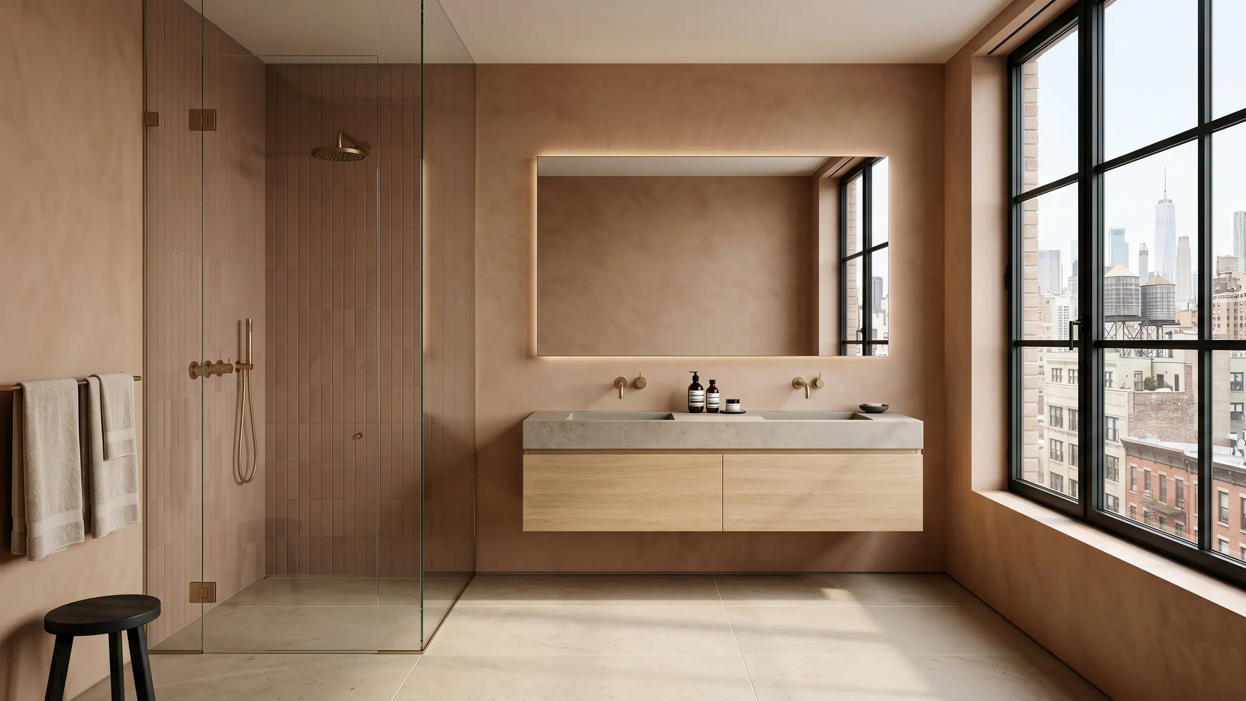
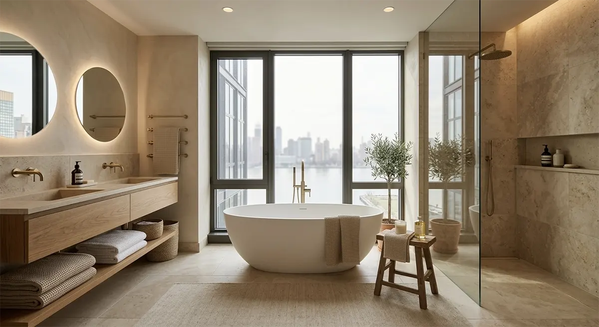
1. Warm Stone White and Raw Travertine
This is the most widely specified combination in higher-end Manhattan bathroom renovations right now, and for good reason. It is simple, materially rich, and almost impossible to execute badly.
The palette works by pairing a warm white, an off-white with a slightly creamy or sandy undertone, with the natural variation of travertine or a travertine-look porcelain. The result is a space that reads as nearly monochromatic but has enormous visual depth because of the texture and vein movement in the stone.
Fixtures in unlacquered brass or warm brushed gold complete the palette. This is a matte warm metal that pulls out the ochre and amber tones already present in travertine, not gold in the shiny, maximalist sense.
Why it works in NYC apartments: The warm-white-and-travertine combination is forgiving in bathrooms with limited natural light, which is most of Manhattan. Cool whites under artificial light can look slightly blue or grey. Warm whites stay warm under any light source, and travertine’s natural color range includes tones that read as light and luminous even in a windowless bathroom.
2. Deep Sage and Warm Cream
Green has been building in bathroom design for several years, and in 2026 it has moved past the point of being a statement color into something closer to a serious neutral. The version doing the most work right now is a desaturated, slightly grey-toned sage, not a bright or obviously green tone.
Paired with warm cream, whether on a plaster wall, a painted ceiling, or a cream-toned tile, sage reads as quiet and sophisticated. It does not compete with the materials around it. In a pre-war Manhattan apartment where the bathroom tends to be smaller and more enclosed, this combination creates a sense of intimacy without heaviness.
Common mistake: Choosing a sage that is too saturated or too obviously green. The versions that work best in NYC bathrooms lean toward grey-green or grey-blue-green. A pure, bright sage in a small bathroom with one window will dominate and tire. Err toward a more complex, desaturated tone.
3. Charcoal and Warm White: The High-Contrast Approach
For clients who want something graphic, grounded, and masculine without going full dark room, charcoal-and-warm-white is the reliable high-contrast combination. It is more current than black-and-white because charcoal carries warmth, and the warm white prevents the space from feeling cold or clinical.
This works best in bathrooms with at least one strong natural light source. A fully enclosed charcoal bathroom without daylight will feel oppressive regardless of how well it is executed. In a bathroom with a window, the contrast reads as intentional and refined.
In Manhattan apartments, this combination often appears in primary bathrooms in new-construction condos where the architecture is clean and the light is good. It reads as modern in the contemporary sense and suits a client who wants a bathroom that feels like a considered design statement.
4. Terracotta, Sand, and Warm Plaster
This is the most tactile and warmest of the current combinations, and it is gaining significant traction in NYC renovations where the client wants the bathroom to feel like a retreat rather than a utility room. The palette draws from Mediterranean and North African references without being theatrical about it.
Terracotta in a sophisticated bathroom application appears as a warm, brownish-red undertone in handmade or zellige tile, in a limewash paint treatment, or in a reddish-clay plaster. It anchors the space without dominating it when surrounded by sand and warm plaster tones that share the same warm-brown base.
Why it suits NYC: This combination is especially effective in pre-war bathrooms that tend to have slightly lower ceilings and a more enclosed feel. The warm plaster wall treatment adds depth without adding visual weight, and the terracotta floor grounds the space in a way that feels intentional. It is also relatively forgiving of imperfect lighting.
5. Deep Navy and Bone White
Navy in the bathroom has moved through a full trend cycle and come out on the other side as a considered classic choice. The version appearing in current Manhattan renovations is deeper and more complex than the bright navy of a few years ago, leaning toward an inky blue-black that reads as almost charcoal in some lights.
The pairing with bone white, a white with a very slight yellow-cream undertone, is what keeps it from feeling cold. This is a neutral bathroom palette in the sense that it works across a wide range of personal styles and apartment types. It is graphic enough to have a point of view but not so aggressive that it limits resale flexibility.
This combination suits pre-war apartments well because it echoes the logic of traditional millwork, dark lower and light upper, while applying it with current materials and finishes. It also photographs extremely well, which matters for resale in a Manhattan market where buyers often make initial judgments from listing photos.
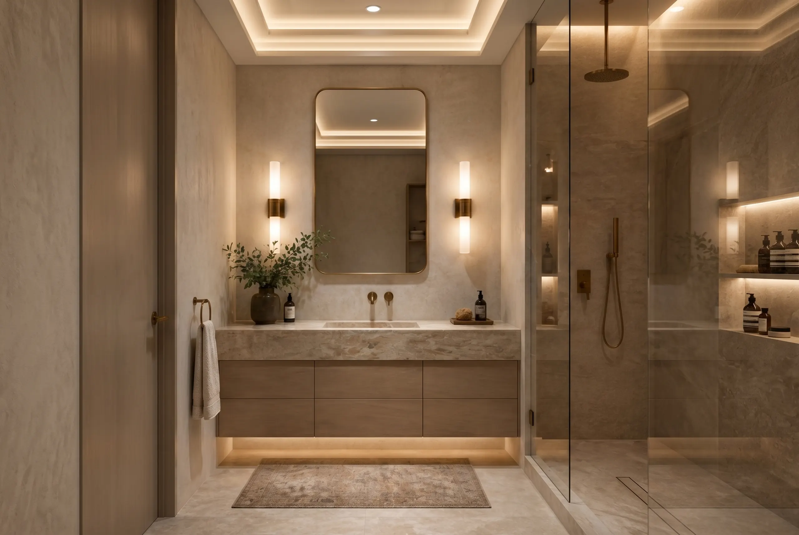
6. Tonal Greige with a Single Material Statement
The most versatile and most enduring approach on this list is also the most restrained. A tonal greige bathroom, built from warm grey-beige tones at different values across floor, wall, and ceiling, is the foundation for a neutral bathroom palette that will not feel dated in ten years.
The interest in this approach comes from a single material statement: a slab of bookmatched stone behind the vanity, a zellige tile feature wall in the shower, a fluted stone panel. The greige palette gives the material room to breathe without competing. The whole space is calibrated to let one element hold the attention.
For homeowners who are uncertain about committing to a strong color, this is the approach that delivers a high-end result without risk. The investment goes into the feature material rather than the overall palette, and that material can be swapped or evolved without redoing the entire space.
What Makes a Bathroom Color Combination Look Expensive
Understanding the underlying logic, not just the specific colors, is what allows you to apply these principles to your own renovation rather than copying a combination that may not suit your apartment’s light or architecture.
Grout Color Is More Important Than Tile Color
This is the detail most homeowners underestimate. Grout lines are visible across every tiled surface and they actively shape how the color reads. White grout on a grey tile creates a pattern. Grey grout on a grey tile creates a surface. In current NYC bathroom design, the direction is almost always toward grout that reads flush with or slightly cooler than the tile, making the tiled plane feel like a continuous material rather than a grid.
The only exception is intentional contrast grout, typically dark grout on a light tile, used as a graphic device. Even then, it needs to be clearly deliberate. Accidental contrast grout, where the grout was chosen from a small sample and reads differently when applied at scale, is one of the most common and most expensive mistakes in bathroom renovation.
Warm Light Changes Everything
Color temperature in lighting has an enormous effect on how bathroom colors read in practice. Cool LED lighting shifts every color toward blue-grey. Warm white LEDs at 2700K to 3000K bring out the amber, ochre, and cream tones in stone and warm tile.
Before finalizing any color combination, test samples under the specific lighting you plan to install in the finished space. A travertine tile that looks warm and sandy under a warm LED looks flat and slightly grey under a cool LED. This is especially relevant in bathrooms without natural light, which is a significant portion of NYC bathrooms.
The Ceiling Is Part of the Palette
In most bathrooms, the ceiling is painted a generic flat white and ignored. In current luxury bathroom Manhattan renovations, the ceiling is often brought into the palette, either by painting it the same color as the walls, creating an enveloping effect, one shade lighter than the walls, or by extending a plaster or limewash treatment from wall to ceiling. This is one of the lowest-cost ways to significantly change how a color combination reads in the space.
One Warm Metal Tone, Deployed Consistently
Mixing metal finishes is a current design convention, but the rule is that each metal serves a different purpose rather than competing at the same scale. The dominant fixture finish, faucet, shower head, towel bar, should be consistent throughout. A secondary metal can appear in accessories, mirror frames, or hardware, but should be clearly subordinate. When two strong metal tones compete at the same scale in a small bathroom, neither reads as intentional.
NYC-Specific Considerations: Small Spaces, Old Buildings, and Light
Most Manhattan Bathrooms Are Not Large
The average Manhattan bathroom is somewhere between 35 and 60 square feet. At that scale, decisions that might read as subtle in a larger space become impossible to miss. This has several practical implications for color choice.
Dark colors can work, but they require either a strong light source or a very deliberate commitment to the enveloping effect. A dark bathroom that works in a townhouse in the West Village may feel suffocating in a 40-square-foot bathroom in a mid-rise rental building. The determining factor is ceiling height and light, not square footage alone.
Light, warm neutrals consistently perform best in constrained Manhattan bathroom footprints. They expand the perceived volume without requiring the precision of a dark, theatrical approach. The travertine-and-warm-white and tonal greige combinations described above were both developed with exactly this context in mind.
Pre-War Building Constraints
Many Manhattan co-ops have building-level restrictions on plumbing work, wet area modifications, and the use of certain materials. Before finalizing any bathroom color scheme that depends on floor-to-ceiling tile or a wet-room configuration, confirm what is permitted. Some buildings require waterproofing certificates, specific backer board systems, or approval for any plumbing relocation.
From a color standpoint, pre-war bathrooms often have original details worth preserving: hexagonal mosaic floors, subway tile wainscoting, cast-iron tubs. A color renovation that works with these elements rather than against them will be less expensive and more distinctive than one that tries to erase them. Painting original subway tile rather than removing it, adding a warm limewash treatment to the upper walls, and updating fixtures and hardware can shift the color story of an original pre-war bathroom without a full renovation.
The Impact of Bathroom Orientation
North-facing bathrooms in Manhattan get no direct sunlight. Color choices for north-facing spaces should consistently lean warmer than you think you need. What looks warm and sandy on a sample card in a showroom may look cool and grey in a north-facing bathroom at 7 AM. The travertine-and-warm-white, terracotta-and-sand, and tonal greige combinations handle north-facing light better than the charcoal-and-warm-white or deep navy approaches, which benefit from stronger daylight to show their contrast.
Colors to Approach with Caution in 2026
Not every color that was interesting two or three years ago has aged well. A few directions are showing signs of fatigue in the NYC market.
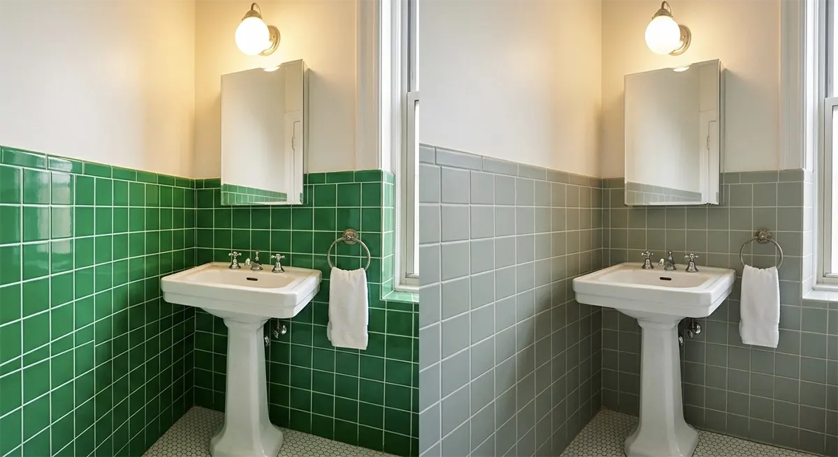
Cool grey tile as a primary surface. The cool grey bathroom was the signature of the 2015–2020 renovation cycle. It reads as dated now, not offensively so, but not current. If you are renovating specifically to update the space, cool grey tile is not the direction.
Bright white subway tile in a standard 3×6 grid. This remains a perfectly functional choice but it no longer reads as a design decision. It is a default. If subway tile appeals to you, consider a larger format, a beveled profile, or a warm-white variation that connects to the broader palette.
High-gloss colored tile in strong saturated tones. Deep teal, cobalt blue, and emerald green in a high-gloss finish had a moment in the early 2020s. The current direction is toward the same colors in a matte or matte-gloss variation, or toward more complex, less obviously decorative versions of those hues.
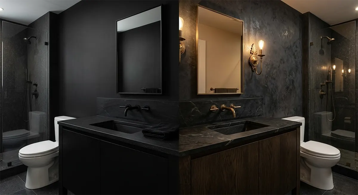
All-black bathrooms without warm accents. The all-black bathroom became a shorthand for luxury in the mid-2010s and has been widely enough replicated that it no longer reads as distinctive. A predominantly dark or black bathroom can still work, but it needs a material story, real stone, textured surfaces, warm bronze rather than matte black, that elevates it beyond the formula.
The Future of the Sanctuary: Bathroom Design Trends and Inspiration for 2025–2026
The bathroom has changed from a purely functional room into a calibrated personal environment. It no

The Ultimate Guide to Bathroom Color Schemes: From Classic Neutrals to Bold Palettes
Key idea: Choosing a bathroom color is an architectural decision, not just a decorating one. Light,

When Space Tells a Story: Designing Homes with Character, Not Just Style
There is a specific feeling you get when you walk into certain homes. You know instantly-someone liv