
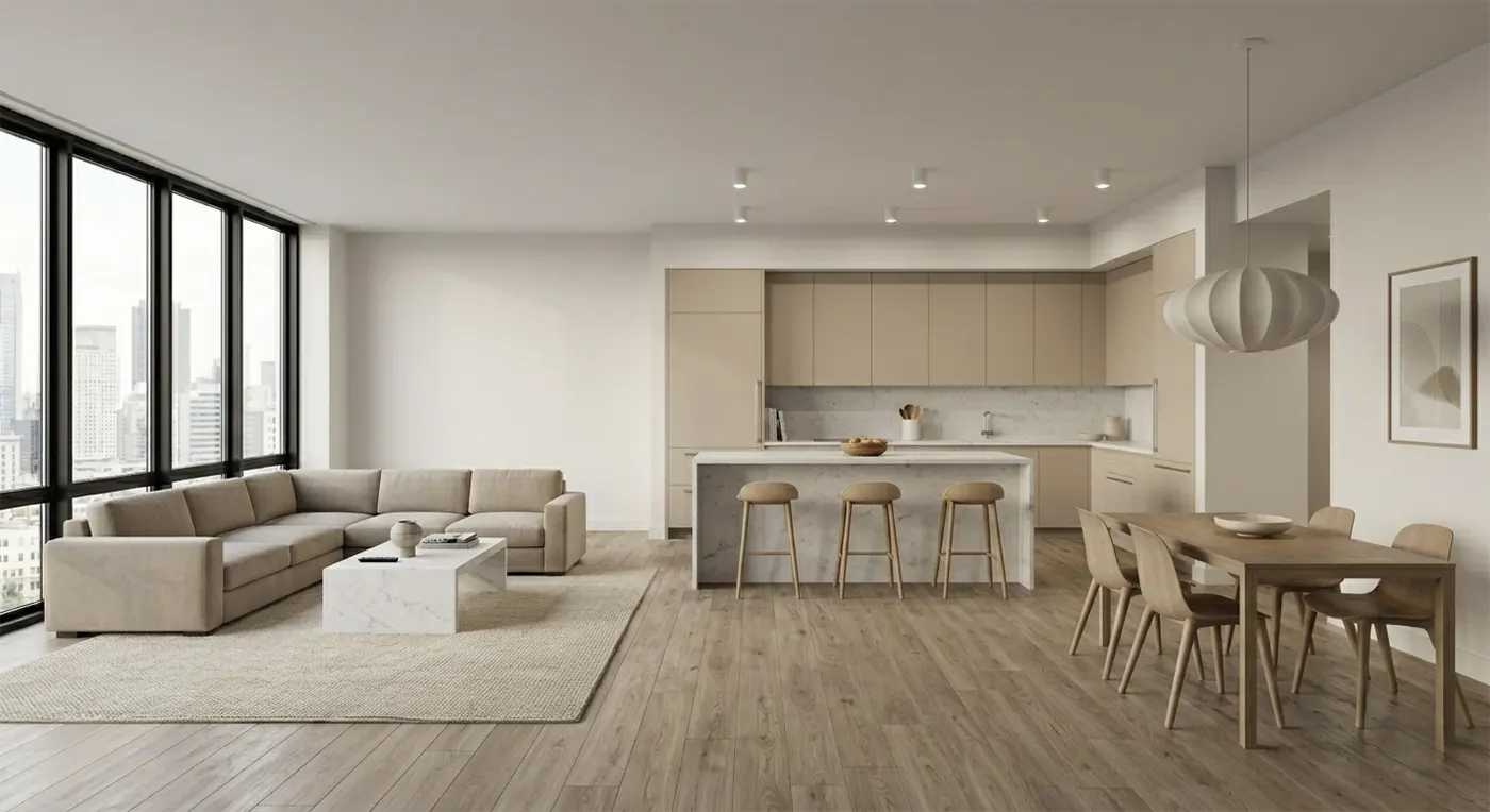
Why “Minimalism” Often Looks Cheap (and How to Do It Right)
Minimalism is one of the most requested design directions in Manhattan apartment renovations, and one of the most misunderstood. Clients typically assume that a minimal interior is a simpler interior: easier to execute, less expensive to produce. The results of acting on that assumption are visible across a great many New York apartments — rooms with white walls, sparse furniture, and visible construction seams that look unfinished rather than refined.
True minimalism demands maximum visual clarity through materials, proportions, and execution of a quality that tolerates no shortcuts. In a style where everything that remains is exposed and deliberate, the surfaces, the joints, the lighting and the spatial relationships are all under scrutiny at once.
Why Minimalism So Often Looks Cheap
Flat, Low-Quality Surfaces Show Immediately
In a room with pattern, texture, and colour, a budget finish has places to hide. In a minimalist interior where the wall is the entire visual statement, the quality of that wall is the room. A plaster finish that was not properly prepared before painting, a paint that photographs flat and dries chalky, a millwork panel with visible grain variation between sheets: these are the room. In a Manhattan co-op where the renovation was handled quickly and the painter primed and rushed two finish coats, the minimalist bedroom that was supposed to feel serene comes across as underinvested.
Poor Proportions Destroy Spatial Logic
Minimalism relies on proportional relationships between elements to create visual tension and calm. There is a working rule for the most visible of these: baseboard height runs at roughly 7 percent of wall height, which puts a nine-foot ceiling at seven to eight inches of base. The failure is not a tall baseboard, it is a mismatched one — a three-inch builder profile under a nine-foot ceiling looks like the trim ran out, and the same eight-inch base under an eight-foot ceiling swallows the wall.
The same discipline applies elsewhere. A doorway that does not align with the centre of the wall it interrupts looks like a mistake. In apartments where the architect did not dimension these relationships explicitly, and where the contractor built to structural adequacy rather than visual precision, the room reveals its errors because there is nothing else to look at.
No Layering Means No Depth
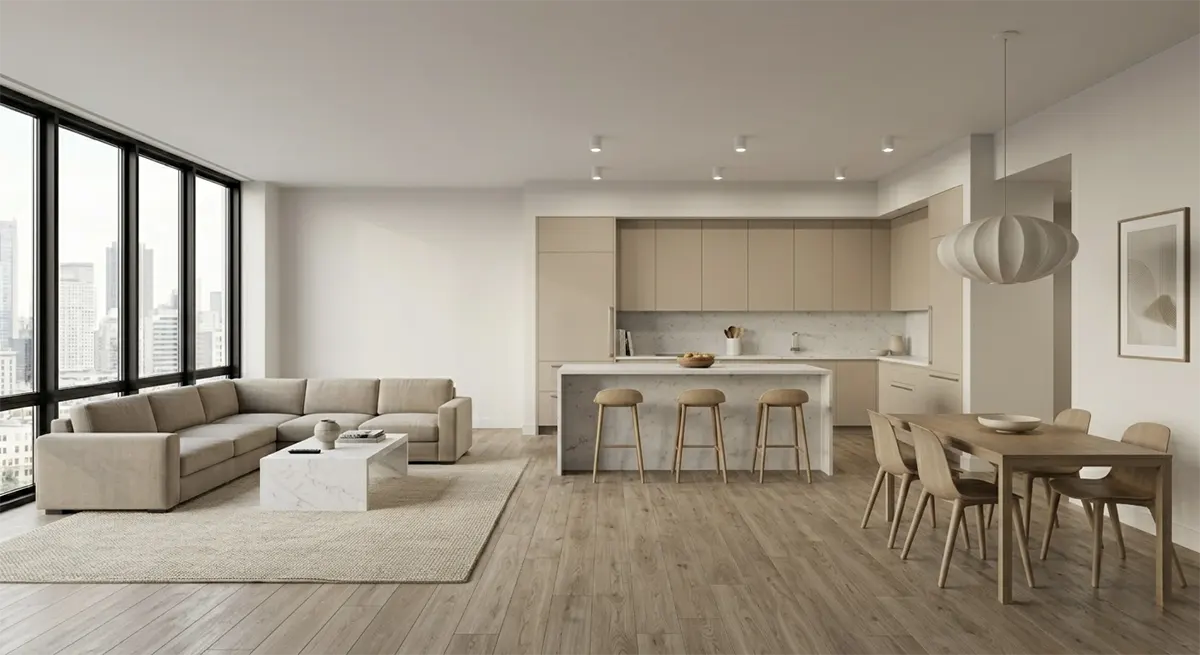
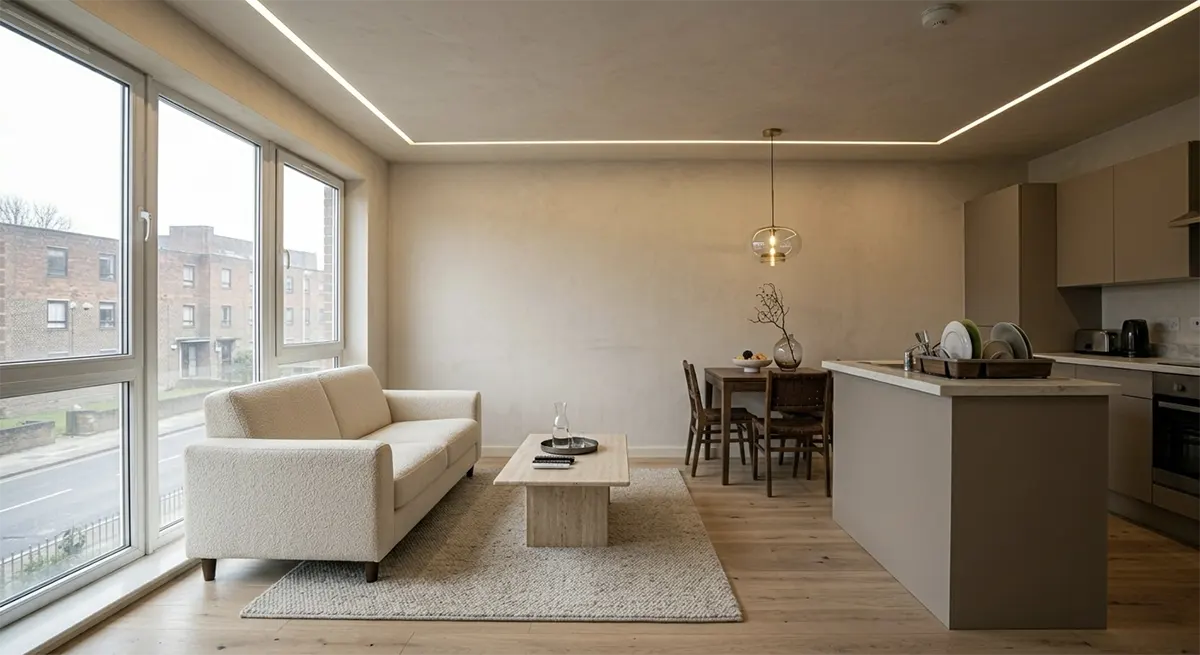
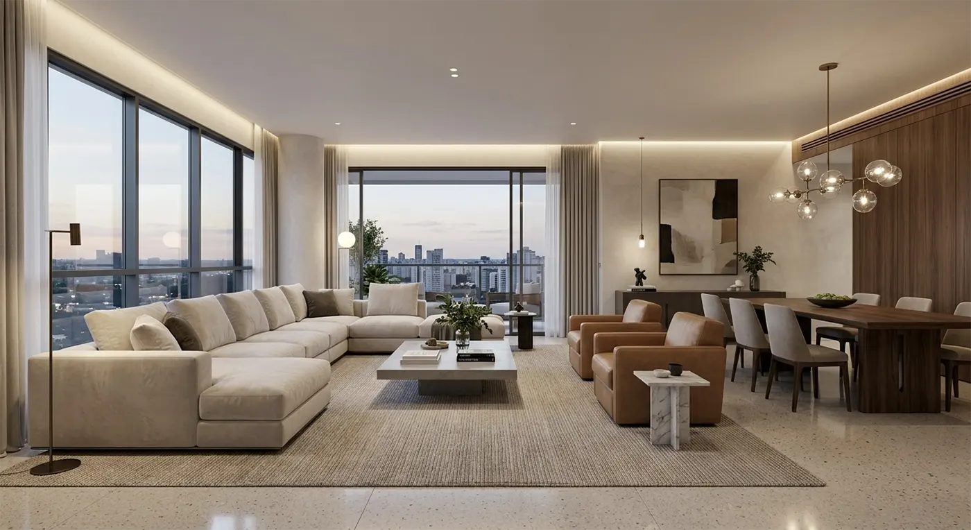
Tatiana Chechina , interior designer at the firm, puts the target in one word: a minimal room should read as quiet. Quiet is not emptiness. It is the result of several subtle layers of material and light working together at low intensity, and it is the thing that separates the two rooms below.
A room with smooth plaster walls, a natural stone floor, linen drapery at the window, and ambient and task lighting at different heights is quiet. A room with drywall, tile flooring, no window treatment, and recessed lights on a single circuit is sparse. The difference lies in considered layering, and that layering requires both budget and design intention to achieve.
Minimalism Exposes Every Construction Flaw
This is the fact clients learn after the renovation is complete and they are living with the result. A traditional interior with crown molding, wainscoting, patterned wallpaper, and layered textiles conceals imprecise drywall taping, slight wall irregularities, and the small deviations that are normal in residential construction. A minimalist interior with flat-painted walls and no transition details conceals none of it. Sanding marks, shadows from an uneven surface, a gap at a baseboard joint: all visible.
There is a specific industry term for the thing that ruins these walls, and knowing it is the difference between a vague complaint and a contract requirement. Joint compound and the paper face of a gypsum board absorb paint at different rates, so a wall finished to the ordinary standard shows the taped joints as bands of slightly different sheen under raking light. The trade calls this photographing, or flashing. It is invisible in a room full of pattern and unmissable on a bare white wall lit from one side.
The fix has a name too. Level 5 is the highest of the six drywall finishing levels, and it means a continuous skim coat of joint compound over the entire surface on top of everything Level 4 requires. It is the specified standard for gloss, semi-gloss and enamel paints, and for critical lighting conditions such as large windows or wall-mounted fixtures — in other words, for exactly the rooms this article is about. Write “Level 5” into the scope. “Smooth finish” is not a specification and will be delivered as Level 4.
Furniture Selection Mistakes Are Amplified
In a furnished traditional room, a poorly proportioned side table is one of many objects. In a minimalist room where a console table, a rug, and a single light fixture are the only elements in a twelve-foot wall section, that console table is the composition. Its depth relative to the wall length, its height relative to the ceiling, its material relative to the floor: all of these relationships constitute the design. When a client selects furniture without professional guidance, based on what looks acceptable in a catalogue, the result is a collection of individual pieces that do not compose. The room looks like it is waiting to be furnished.
Lighting Is Treated as an Afterthought
A grid of recessed downlights does not amount to a lighting design. In a minimalist interior with no chandeliers, no decorative pendants, and no patterned surfaces to absorb and distribute light, the quality and direction of light determines the entire atmosphere of the room. Recessed lights on a single circuit produce flat, institutional illumination. Architectural lighting — uplighting at walls, linear coves, carefully positioned downlights with the correct beam angle, task lighting integrated into millwork — creates depth and warmth from the same white room. The cost of specifying and installing it properly is significant. Skipping it produces a minimalist apartment that looks like a hospital corridor.
The Architectural Context Is Ignored
A prewar co-op with ceiling moldings, plaster medallions, and original window proportions has a specific architectural character that minimalism has to negotiate. Stripping out original details and painting everything white erases an apartment rather than refining it. Calibrating a contemporary interior against existing architectural character is a substantially different skill from starting with a blank box, and it is worth asking any designer to show completed work in prewar stock specifically rather than in new construction.
What High-End Minimalism Actually Looks Like
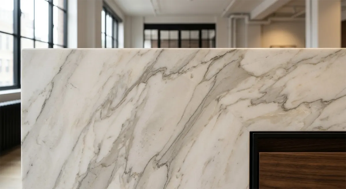
In a genuinely refined minimalist interior, the materials carry the design. A honed stone floor with tight joints and consistent veining does more visual work than any decorative element could. A wall of custom millwork in a matte lacquer finish, with no visible hardware and a depth that gives the room mass, creates architectural presence without complexity. A single freestanding piece in solid bronze or blackened steel holds the room’s attention without competing with anything else.
The stone floor is the one item on that list your building has an opinion about. Replacing a floor in a co-op or condo is governed by the alteration agreement, which typically specifies either a minimum impact insulation class for the assembly or the older requirement that most of the floor area stays carpeted. Stone also weighs considerably more than the wood floor it replaces, so in a prewar building the assembly has to be checked rather than assumed. Get that answer from the managing agent before the slab is selected, not after.
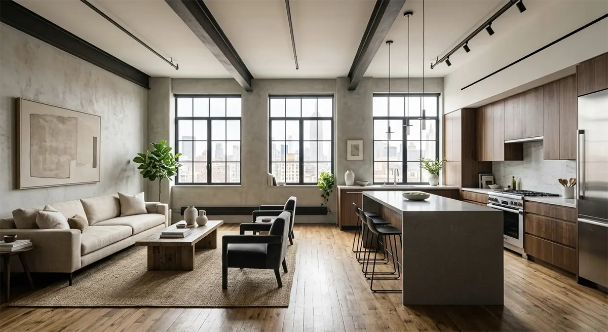
The detailing is precise and specific. Baseboards are the right height for the ceiling. Door casings are either absent or substantial, never vestigial. Transitions between materials are resolved with the same intention as the materials themselves. Lighting fixtures are specified for their relationship to the room rather than selected from a catalogue.
Storage is invisible. A room without visual clutter requires infrastructure for the things that would otherwise produce that clutter. Custom millwork that integrates storage, media equipment, and mechanical systems behind flush-panel doors is expensive to produce, and it is what separates a minimalist interior that functions from one that looks as though the occupant has not moved in yet.
What to Specify Before Anyone Starts Work
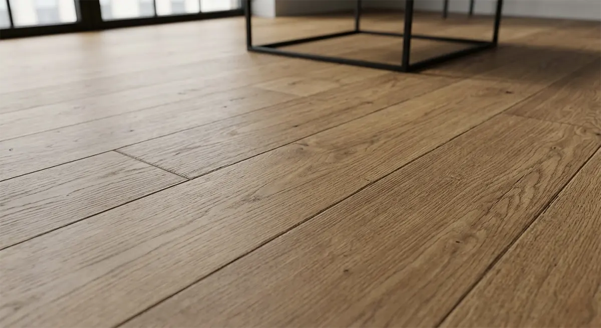
The difference between the two sets of photographs above is mostly decided on paper, months before a wall goes up. Six items belong in the scope, and each is a place where a minimal room is either won or lost.
- Wall finish, named by standard. Level 5 for painted walls, written into the contract. If the design calls for plaster instead, decide early, because the two are not adjacent in cost.
- A lighting scope of its own. Not a fixture schedule attached to the electrical drawings, but a designed layer: beam angles, colour temperature, dimming, cove and millwork integration. On a minimal interior this is architecture, and it has to be drawn before the ceiling closes.
- Shop drawings for every piece of millwork, reviewed and signed before fabrication. Reveals, hardware, panel joints and grain direction get resolved on paper or they get resolved on site by whoever is holding the saw.
- Full-size samples viewed in the apartment, not in a showroom. A stone slab, a plaster sample board at least two feet square, a finished millwork door. Approve them in the room’s own light at morning and at night, which in a Manhattan apartment is often two different colours.
- A dimensioned elevation for every wall that matters, not just a plan. Baseboard height, door casing, the centreline of openings, the distance from the top of the millwork to the ceiling. Proportion is the one thing that cannot be fixed afterwards.
- A mock-up where the stakes are highest. One wall finished to the specified standard, lit as it will be lit, before the same crew does the other forty.
Two practical notes for an occupied building. A full skim coat or a plaster application is dust-heavy work across every room at once, so containment, working hours and debris removal need to be agreed with the managing agent rather than assumed. And if the specification involves stripping back to the original substrate in a prewar apartment, that is demolition: plaster and tape compound of that era can contain asbestos, and a survey by a New York State licensed asbestos inspector precedes the work rather than following it.
What It Costs to Do Properly
The argument that minimalism is more expensive is usually made in the abstract. It is more useful with numbers attached, and the wall finish is the clearest example because it is the single largest surface in any room.
A Level 5 finish runs roughly 2 to 5 dollars per square foot installed, and the upgrade from the standard Level 4 alone adds something in the region of 25 to 50 percent to the finishing line. That is the entry point for a wall that will survive being looked at.
Venetian or lime plaster runs 12 to 30 dollars per square foot installed, with most residential work landing between 12 and 20. Material is only 2 to 8 dollars of that; the rest is labour, because the finish is built up in two to four coats and burnished by hand.
The gap between those two numbers is four to ten times, on the surface that carries the entire room. That single comparison explains more about why minimalist renovations come in higher than any general statement about quality. Architectural lighting is a second line of the same kind, and concealed millwork is usually the largest single item in the whole job.
None of which argues for plaster everywhere. It argues for deciding where the money goes before the drawings are finished, because a minimal room has nowhere to hide the decision.
Design Principles That Separate Refined from Reductive
| Principle | What It Means in Practice |
|---|---|
| Texture without pattern | Stone with natural surface variation, linen with a loose weave, oak with pronounced grain — layered at different scales to create visual complexity without introducing pattern. |
| Controlled negative space | The distance between the sofa and the opposite wall, the height of the coffee table, the space above the bed to the ceiling — proportional intervals set explicitly, not left to chance. |
| Custom millwork as infrastructure | Integrated storage, concealed mechanical systems, flush-panel doors that sit level with the wall, and built-in seating with clean profiles give a minimal room its sense of calm completeness. |
What Owners Get Wrong
The most common mistake is equating minimalism with removing furniture. A room with a bed, a nightstand, and nothing else is under-furnished. Minimalism is about the quality and intentionality of what is present, not the quantity.
Choosing budget finishes is the second most prevalent error. The appeal of a minimal interior is partly that it appears to require fewer materials, but fewer materials at budget quality costs more than it looks, because the budget material carries the entire visual weight of the room and fails visibly under that responsibility.
Ignoring layout and flow in favour of visual simplicity produces rooms that look organised in a photograph and do not function in person. Minimalist interior design in a Manhattan apartment is about how a space works over years of daily use rather than how it photographs on one afternoon.
Minimalism Is More Demanding, Not Less
The premise that a minimal room is easier and cheaper to produce than a richly layered one has it backwards. A minimal room offers no visual protection. Every surface is evaluated on its own terms, every proportion is held to account, and every lighting condition is exposed. The execution tolerance is smaller, the material specification is higher, and the planning required is more intensive.
In Manhattan apartment renovations, where the investment in construction is substantial and the result is lived in daily, minimalism done well is one of the most rewarding outcomes possible. Done without an understanding of what it requires, it produces rooms that look like an unfinished version of something else.
Getting it right requires designers who work from material and proportion before selecting a single finish, who specify lighting as architecture rather than as a functional layer, and who treat the space between objects as carefully as the objects themselves. That discipline, applied consistently through design and construction, is what produces an interior that looks resolved rather than reduced.
Kitchen Work Aisles and Clearances: Which Numbers Are Actually Required
The number everyone repeats for a kitchen aisle is 42 inches, and in New York City that is not the m
Kitchen Design Styles: Japanese, Scandinavian, Mid-Century Modern, and Contemporary
Four renovation projects in the last eighteen months across the Upper West Side had almost identical
Furniture Placement Rules Designers Use in Open Layouts
The open layout is one of the most requested outcomes in Manhattan apartment renovations, and one of