

The Psychology of Space: Why Good Design Feels Effortless
When you walk into a room and immediately feel at ease, something more than good looks is at work. Architecture, layout, light, and materials shape how your mind and body respond before you consciously assess anything. Good design doesn’t only look effortless. It feels effortless, and that sensation is built rather than found.
Space as a Mood-Shaper
Interiors influence mood, attention, and behavior, and some of that influence is measurable rather than anecdotal.
One of the clearest examples comes from a 2013 study published in PNAS, where researchers put participants in an fMRI scanner and showed them interior rooms that were either curvilinear or rectilinear. Curved rooms were consistently judged more beautiful, and the difference appeared in brain activity, not just in the ratings people gave.
The part usually left out is more interesting. Contour had no effect on whether people chose to enter or exit a space. Shape changed how beautiful a room was judged; it did not change whether people wanted to be in it. That distinction matters when you are spending money: curves are an aesthetic lever, not a comfort lever, and the things that make a space livable operate separately.

What Actually Makes a Space Feel Effortless
Flow and layout
When movement through a space is obvious, you stop spending attention on it. When it isn’t, you spend a little every time you cross the room, and it accumulates.
The measurable version of this: a primary circulation path wants at least 36 inches of clear width, and 42 where the route carries daily traffic. Below that, people start turning sideways to pass furniture, and a room that looked generous on the plan feels tight in use.
Proportion and scale
Ceiling height, room dimensions, and the ratio of wall to window all shape how a space registers. These are the hardest things to change in an apartment and the easiest to work against by accident, usually by adding something that lowers the ceiling or blocks a window.
Light
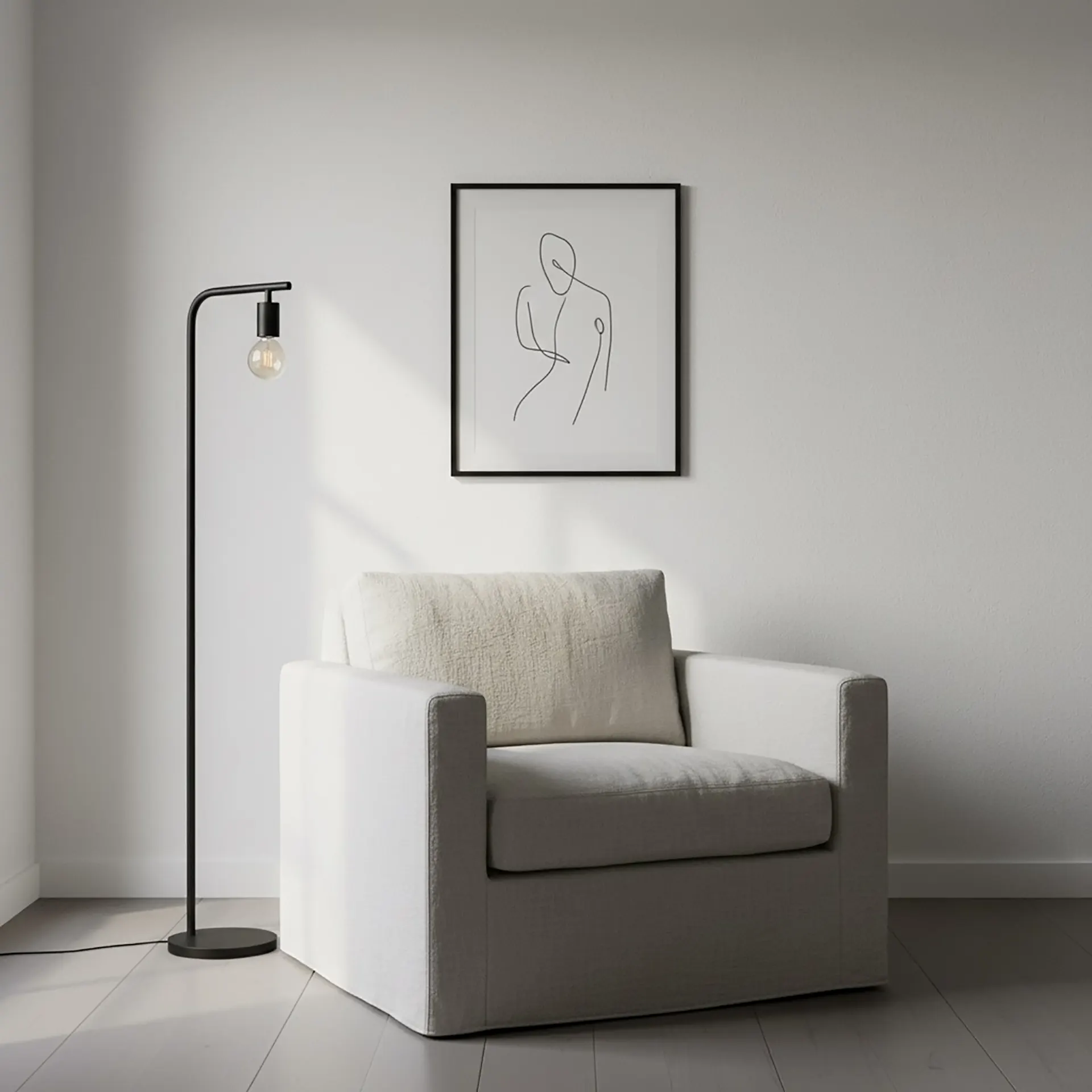
Daylight is the strongest single variable, and in an apartment you cannot add more of it. What you can do is stop wasting what arrives: keep the window wall clear of tall furniture, and avoid running the main circulation path along it, which turns the brightest part of the room into a corridor.
Color, texture, and material
Warm textures and natural materials read as calm. Cooler tones and hard finishes read as sharper and more formal. Neither is correct in the abstract; the question is which register you want each room to sit in, and whether the rooms agree with each other.
Room for you in it
A space feels like yours when you can see yourself in it. Apartments finished entirely to a designer’s palette, with nothing personal left visible, tend to feel like a hotel, and people describe them that way without knowing why.
Effortless Is Not the Same as Simple
When a space feels natural, it usually means the complications were resolved before you walked in.
Interior designer Tatiana Chechina points to the sofa as the recurring example: placed for the view or the symmetry, it lands in the walking route between the entry and the kitchen, and the client feels vaguely that the room doesn’t work without identifying that they’ve been walking around their own furniture for a year. The fix is not a better sofa. It’s placing it against the circulation path in the first place.
How This Plays Out in 700 Square Feet
Most of the advice above is written as though you can change the shell. In a typical Manhattan one-bedroom you cannot, so it’s worth walking through what these principles look like when the constraints are fixed.
Assume a common set of conditions: around 700 square feet, one exposure so daylight arrives from a single direction, and eight-foot ceilings in a post-war building.
The ceiling is the constraint you cannot argue with. You are not raising it, which means the priority becomes not lowering it further. Dropped ceilings, deep soffits, and thick flooring build-ups all cost height you don’t have. Storage goes tall and narrow rather than long and low, because vertical lines return some of what the ceiling takes away.
The single exposure decides the plan. Everything that benefits from daylight sits along that wall, and the circulation path runs along the interior edge instead. This is the opposite of what most people do instinctively, which is to leave the window wall clear as a walkway and push the seating into the dark half of the room.
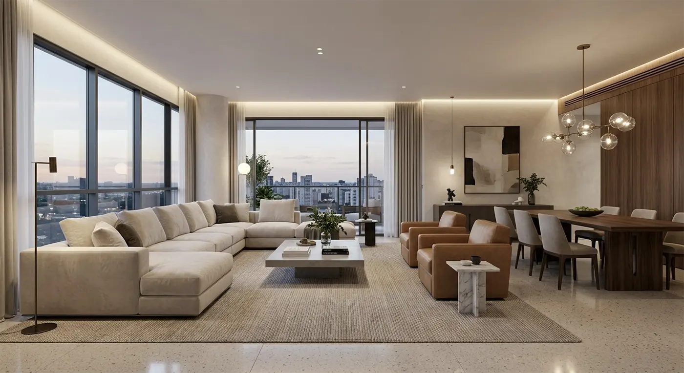
With no walls to work with, furniture does the zoning. A sofa’s back becomes the boundary between living and dining. Two properly sized rugs separate the areas more effectively than any amount of furniture arrangement without them. And every one of those decisions has to leave the 36 inches of circulation intact, which is what turns a 700-square-foot apartment into a planning problem rather than a shopping problem.
None of this makes the apartment larger. It makes the apartment stop reminding you that it isn’t.
Practical Steps
- Walk the plan before you commit. Trace the route from the entry to each room. Short and obvious is the goal.
- Check your orientation. Find out which way your windows face and when the light actually arrives, then plan around that rather than around the floor plan alone.
- Protect the ceiling height you have. In a post-war apartment, every inch you give to a soffit or a thick floor assembly is one you will feel.
- Choose materials you will touch. Floors, fabrics, and counters are the things you make contact with daily, and how they feel matters as much as how they photograph.
- Leave something of yours visible. A fully styled room with nothing personal in it reads as a showroom.
- Bring the team in early. Layout decisions made before construction cost nothing to change. The same decisions made after cost demolition.
Why It Holds Its Value
It is tempting to claim that calm, neutral apartments sell better than strongly styled ones. In the Manhattan luxury market that isn’t reliably true: distinctive, heavily designed apartments often command a premium from buyers who want exactly that.
The more defensible point is that style and function are separate variables. An apartment can be beautifully finished and still have a circulation path that forces you around the furniture, a window wall used as a hallway, or a ceiling made lower than it needed to be. Those problems don’t photograph, and they don’t go away when the styling changes. Getting the spatial decisions right is what lets any style, restrained or bold, actually work in daily use.

Budget-Friendly Bathroom Upgrades That Actually Make a Difference
A bathroom renovation doesn’t have to mean weeks of construction and an invoice that makes you
Furniture Placement Rules Designers Use in Open Layouts
The open layout is one of the most requested outcomes in Manhattan apartment renovations, and one of
Small Dining Rooms and Breakfast Nooks in NYC Apartments
A small dining room can be comfortable and useful if the layout and the pieces fit the footprint. Th