
The Manhattan Palette: Timeless Color Combinations for Urban Interiors
Look out the window. What do you see? Concrete. Brick. Steel. Glass. The grey of the street, the rust of the water towers, the relentless glare of the sun bouncing off a million windows.
Designing a color palette for a Manhattan apartment isn’t just about picking pretty shades. It is about physics. It is about managing the unique, often harsh light of a vertical city and creating a visual exhale the moment you walk through the door. At Hoppler Design and Build, we believe the perfect NYC palette isn’t a trend. It is a response to the city itself.
1. The Science of City Light
Before we pick a paint chip, we look at the compass. Light in New York is different than light in the Hamptons or California. It is often obstructed, reflected, or filtered through the glass of the building across the street.
| Orientation | Light Quality | Design Strategy |
|---|---|---|
| North-Facing | Cool, consistent, blue-tinted | Use warmth (yellow/red undertones) to avoid a clinical feel |
| South-Facing | Intense and warm | Use cooler, darker tones to absorb glare and create calm |
We use a metric called LRV (Light Reflectance Value) to determine exactly how much light a color will bounce back into the room. It is not magic; it is measurement.

2. The New Neutral: Retiring the Grey
For a decade, New York was obsessed with Cool Grey. It was the safe choice. It was also, frankly, a bit depressing. The modern Manhattan palette has shifted. We are moving toward Limestone and Parchment.
These are living neutrals — complex whites with undertones of taupe, sand, or crushed shell. Unlike flat grey, which absorbs the city’s gloom, these warm neutrals catch the light and hold it. They make a space feel like a sanctuary, not a showroom. These tones pair perfectly with the natural materials we prize today — white oak floors, unlacquered brass, and Calacatta marble.
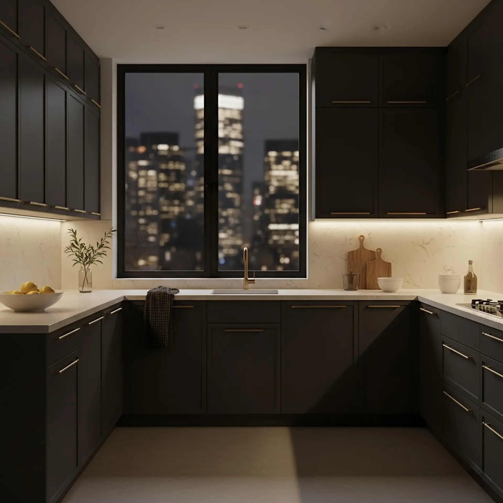
3. The Tuxedo Effect: Contrast as Architecture
Manhattan is a city of contrast — shadow and light, old and new. We often employ what we call the Tuxedo Palette: high-contrast architectural detailing. This means keeping the walls soft and airy, but painting the window mullions, the ironwork, or the interior doors in a deep, rich Black or Charcoal.
The Effect: It frames the view. When you frame a window in black, the eye is drawn through it. The chaotic city view becomes a painting. It turns the architecture into a picture frame for the skyline.
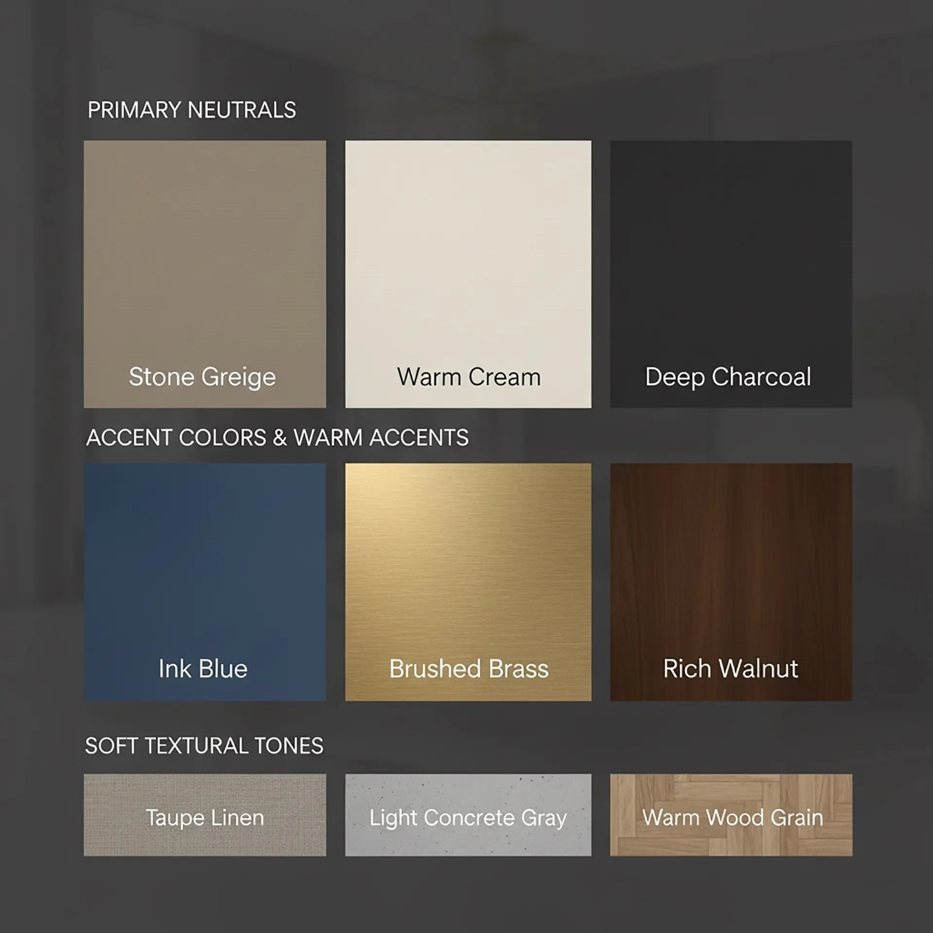
4. Embracing the Dark (The Jewel Box)
There is always that one room in a NYC apartment — the powder room, the den, or the hallway — that gets zero natural light. The amateur mistake is to paint it bright white to make it feel bigger. The professional move: embrace the darkness.
We flood these small, lightless rooms with deep, saturated color: navy blue, forest green, aubergine, or charcoal. By leaning into the moody atmosphere, you turn a cramped room into a cozy Jewel Box. It feels intentional, intimate, and incredibly luxurious.
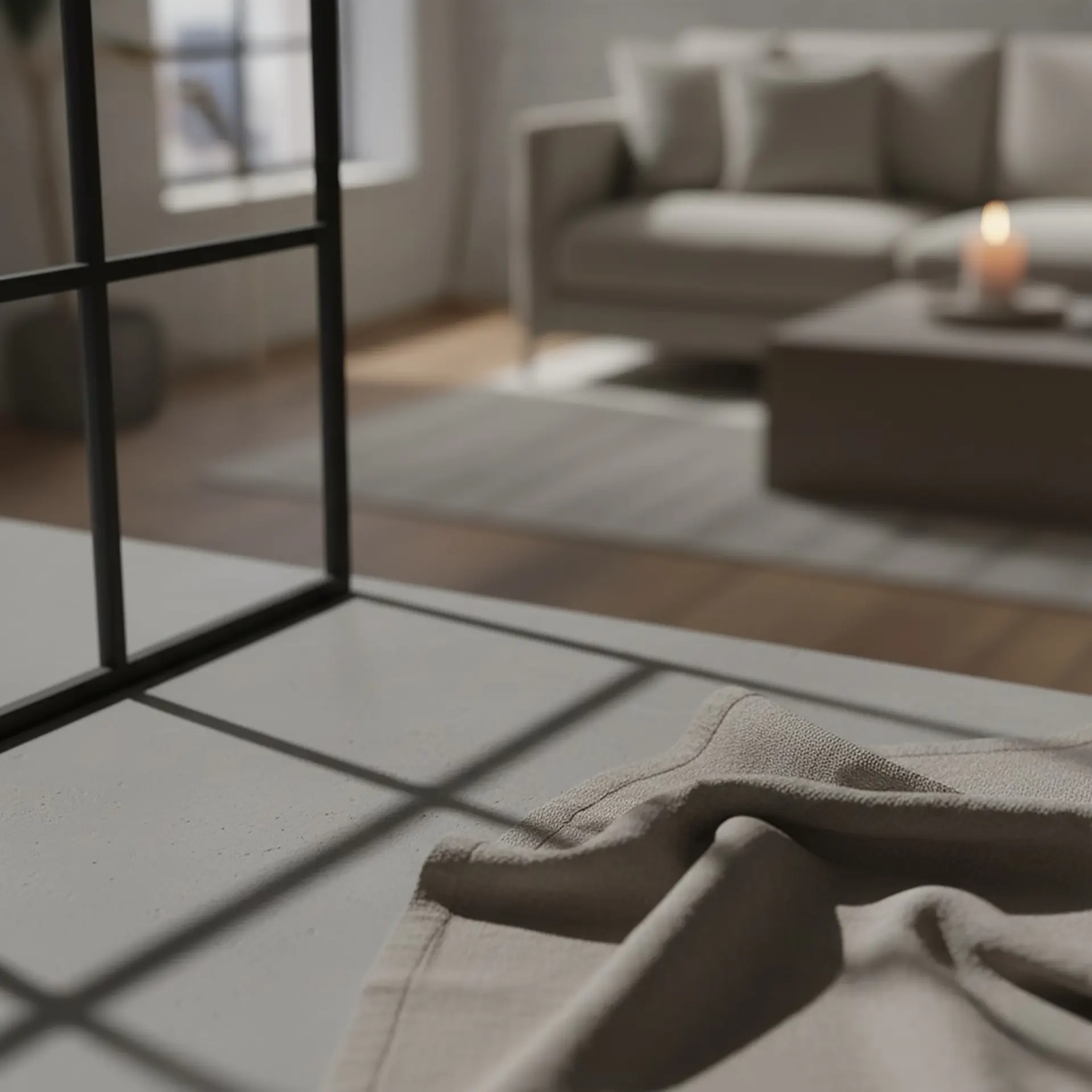
5. Texture is a Color
Finally, remember that in a monochromatic city, texture acts as a color. A white plaster wall reads differently than a white painted drywall. A boucle sofa reads differently than a linen one. When we limit the color palette to quiet neutrals, we dial up the texture. We layer wool, stone, wood, and metal. It creates a space that is visually quiet but tactilely loud.
The Manhattan Palette Philosophy
The goal of the Manhattan Palette isn’t to distract you. It is to ground you. It is about creating a canvas that is strong enough to stand up to the city outside, but soft enough to let you rest within it. It is not just paint. It is peace.
Tatiana Chechina
Interior Designer & 3D Visualizer

In urban interiors, color usually works best when it’s supported by texture rather than contrast alone. Layering plaster, natural stone, wood, linen, or brushed metals within a similar tonal palette creates much more depth than using multiple strong colors. This approach also helps interiors remain timeless as trends shift over time.

Renovation Contracts in NYC: How to Protect Your Investment Before Work Begins
There is a specific moment before the hammers swing, before the dust rises like flour in a busy bake

Bringing the Outside In: How Biophilic Design Changes the Way a Home Feels
There’s a reason certain spaces feel immediately right the moment you walk into them. Natural

How to Combine Old and New: Mixing Vintage With Modern Design.
Walk into a beautifully designed home, and you can often feel it before you understand it — a quie