Texture Talk: Adding Depth and Warmth to Your Interiors
Color gets all the credit. Furniture gets all the attention. But texture is what makes a room feel alive.
It’s the element that separates a space that looks good in photographs from one that genuinely feels good to be inside. Texture engages something more instinctive than visual preference. It creates the sense of warmth, weight, and presence that makes a room feel inhabited rather than staged. The most memorable interiors layer texture deliberately, building a conversation between materials that keeps the eye moving and the senses engaged. Smooth against rough. Matte beside glossy. Soft surfaces anchoring hard edges. When those relationships are considered, the result is a space that feels both sophisticated and deeply comfortable. Any experienced interior designer in New York City will tell you that texture is where rooms stop looking designed and start feeling like home.
The Foundation: Fabric and Soft Textures
Fabric is where most texture schemes begin, and for good reason. It’s the most accessible material category, the most varied, and the one that has the most immediate effect on how a room feels at a human scale.
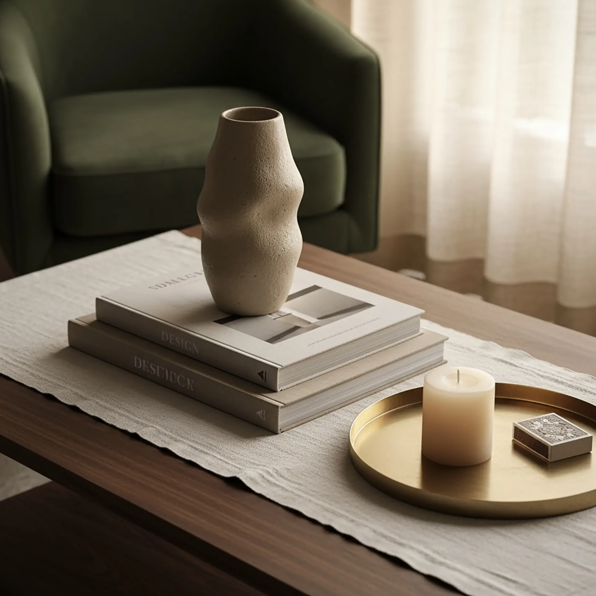
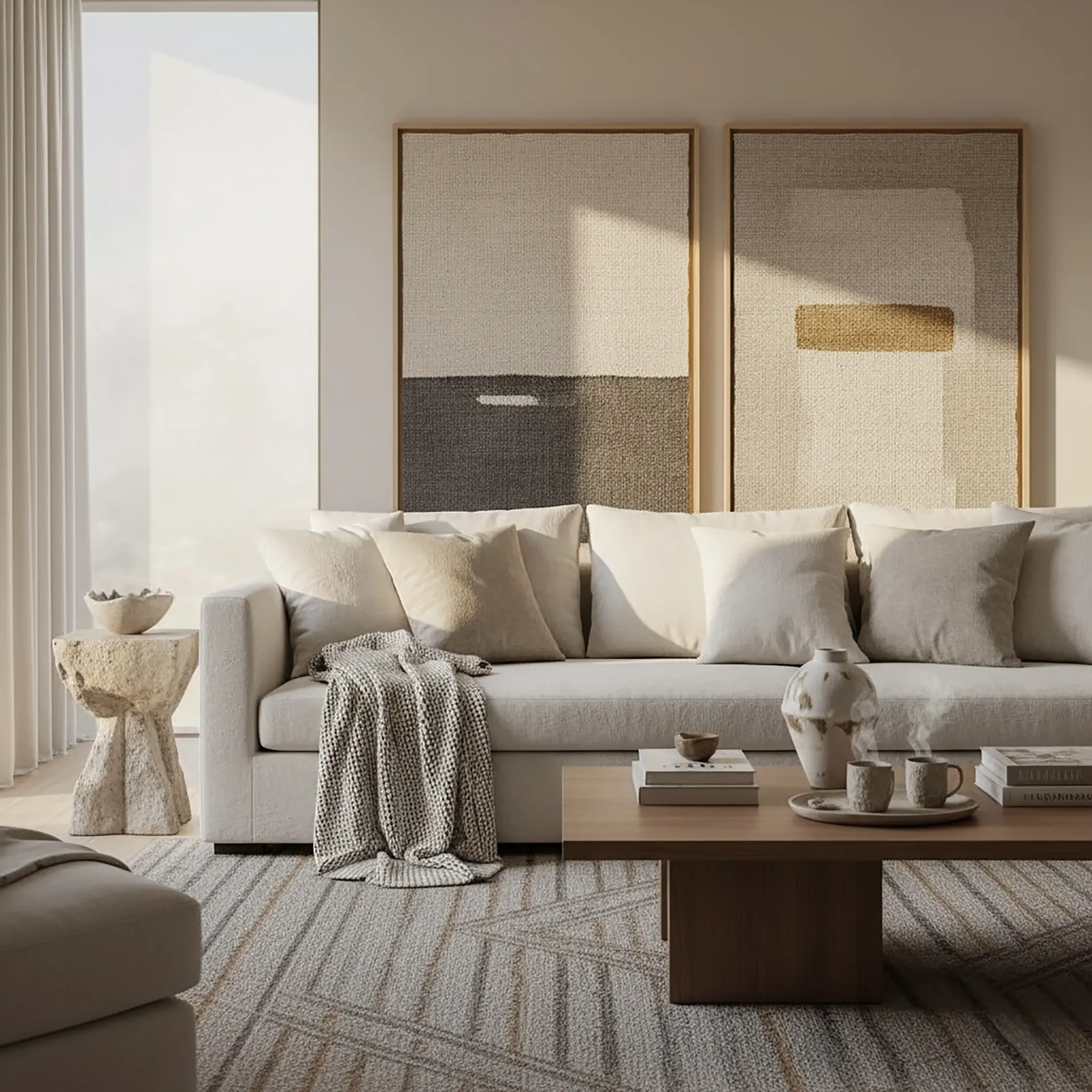
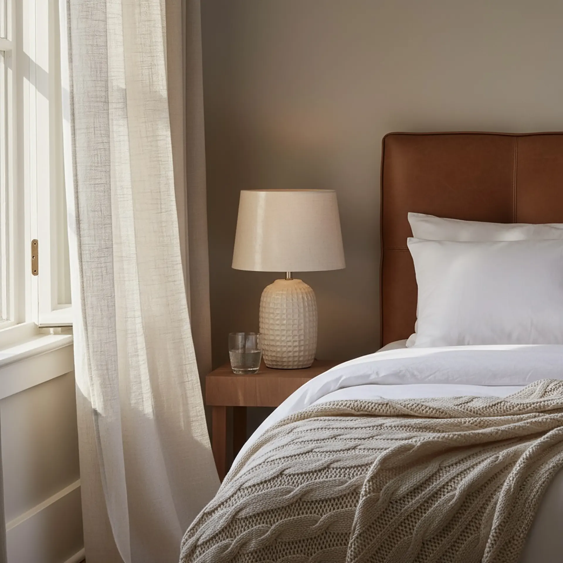
Velvet catches light in a way no other fabric does, shifting in tone as you move through the room and lending an immediate sense of luxury to even simple silhouettes. Linen brings the opposite quality: relaxed, slightly rumpled, casually elegant in a way that softens formal spaces and grounds minimal ones. Wool offers durability alongside warmth, working as hard in an area rug underfoot as it does in a throw draped over a chair. Silk reflects light with a quiet sheen that adds sophistication without effort.
The real skill lies in the mix. Smooth leather seating paired with nubby wool cushions. Crisp cotton curtains beside a plush velvet ottoman. Layering different fabric weights and weaves within the same color family creates a monochromatic scheme that feels rich and complex rather than flat, adding depth without relying on contrast or pattern to do the work.
The Backbone: Architectural and Hard Surfaces
If soft textures are what you feel, architectural textures are what you remember. These are the permanent decisions that define a space’s character for years, and they deserve the same level of intention as any structural or layout choice.
Natural stone carries geological history in every variation of its surface. Whether it appears in a fireplace surround, a kitchen backsplash, or a bathroom floor, it introduces a weight and organic complexity that no manufactured material fully replicates. Wood moves in the opposite direction, from smooth contemporary finishes that recede quietly into a scheme, to rough-hewn beams that command attention and bring genuine warmth to a room. Metal finishes occupy their own register entirely. Brushed surfaces diffuse light gently and read as understated. Hammered or patinated metals create focal points that reward close attention.
In Manhattan renovations, these decisions are made during construction and shape every decorating choice that follows. Working with a design-build team that thinks about texture as part of the architectural brief, rather than something to be added afterward, produces spaces where every material feels intentional and nothing reads as an afterthought.
The Art of the Mix: Balancing Textural Elements
Understanding individual materials is only the beginning. The more interesting question is how they work together, and the answer lies in three principles: scale, contrast, and balance.
Scale matters because large textures need room to breathe and counterparts that don’t compete with them. Exposed brick reads beautifully against smooth plaster. It becomes chaotic against reclaimed wood planking and a patterned rug simultaneously. Contrast is what creates visual energy. Rough paired with smooth, matte set against gloss, soft anchored by hard. Without contrast, even the most beautiful individual materials produce a result that feels monotonous. Balance is what keeps contrast from becoming conflict. The most successful textural combinations share at least one common thread, whether that’s a consistent color temperature, a shared scale, or a unified style reference, that holds the variety together.
The interiors that stay with you are the ones where every tactile element contributes to a coherent story. Not a story about design, but about the pleasure of being in a particular space at a particular moment.
Which Materials and Surfaces Work Best for Adding Texture to an Interior?
The most effective materials combine visual presence with genuine tactile quality. Natural wood in slatted panels, rough-sawn planks, or warm oak and walnut finishes adds warmth and architectural depth. Textured wallpapers in grasscloth, linen, silk, or embossed patterns introduce surface interest without permanent modification. Stone surfaces including travertine, marble, and textured tile bring a refined, sculptural quality. Decorative plaster finishes such as Venetian plaster, limewash, and clay plaster create soft organic movement on walls that paint alone cannot achieve. Fabric elements in bouclé, velvet, and layered wool add immediate warmth. Fluted panels, ribbed gypsum, and three-dimensional wall treatments introduce architectural texture. Metal accents in brushed brass, patinated steel, or aged bronze contribute subtle sheen and material contrast.
The right combination depends on the specific space, its proportions, its light quality, and the overall design direction. A consultation with a design team is the most reliable way to identify which materials will work hardest for a particular room.
What Are the Most Effective Ways to Add Texture Without Major Renovation Work?
Significant textural richness is achievable without construction, though the approach in a Manhattan apartment should account for building rules and lease terms before any wall treatments are considered. In co-op, condo, and rental buildings, modifications to walls, including adhesive-based panels and wallpaper, typically require board notification or landlord approval. Confirming what’s permitted in your specific building before purchasing materials is always the right first step.
Within those parameters, layered textiles offer the most immediate and versatile impact. Throws, cushions, area rugs, and window treatments introduce multiple textures simultaneously and can be adjusted as preferences evolve. Furniture with inherent textural quality – bouclé armchairs, rattan side tables, linen sofas, ribbed dressers – adds material depth without touching a single wall. Decorative objects including ceramics, woven baskets, sculptural vessels, and natural materials bring dimension to surfaces and shelves. Wall art with dimensional elements, mixed media pieces or framed textile panels, introduces texture at eye level. Accent paint techniques in matte, satin, chalk, or genuinely textured finishes can transform a wall within a single weekend and, unlike adhesive treatments, are almost universally permitted in rental and co-op apartments with standard repainting rights.
The result, when these elements are layered thoughtfully, is a space that feels considered and warm without a single contractor involved.

Microcement Bathroom: The Seamless Alternative to Tile
If you have ever spent an afternoon scrubbing grout lines in your bathroom, you probably had the sam

Luxury for Less: Where to Score High-End Materials at Designer Discounts
After fifteen years working on renovations across Manhattan, I’ve come to believe that the dif

Future-Proofing Your Renovation: Materials That Will Still Look Great in 20 Years
The difference between a renovation that dates and one that doesn’t usually comes down to mate