
The Ultimate Guide to Bathroom Color Schemes: From Classic Neutrals to Bold Palettes
Key idea: Choosing a bathroom color is an architectural decision, not just a decorating one. Light, material, finish, and daily use all define the final result.
How Color Changes Space
Color changes how the eye measures a room. Pale, reflective tones bounce light and make walls recede. Dark, low-reflectance tones absorb light and cause corners to blend into shadow. Mid-tones give stability and hide small flaws. These effects are true whether a bathroom is 30 square feet or 300 square feet.
But the emotional effect of color depends on more than hue and lightness:
- Undertone matters. A beige with a pink undertone behaves differently from a beige with a green undertone.
- Finish matters. Matte paint reduces glare and feels softer under direct light. A glossy tile will reflect fixture highlights and show every splash.
- Light matters most. Always sample on-site and view at the times you will actually use the room.
Greens and Blues: Calm and Restorative Palettes
Green and blue are the easiest way to create a restorative mood in a bathroom. They relate to water and vegetation, and our brains generally read them as restful.

Sage & Soft Green
Works well in small bathrooms because they read warmer than pale grey, yet remain restrained. Pair with brushed brass or aged bronze for a comforting, spa-like result.
Deep Green (Forest / Emerald)
Dramatic and best as an accent or in small powder rooms. Use matte-finish tiles and add under-cabinet or niche lighting to keep surfaces from disappearing.
Blue
- Soft sky blue — expands space, feels gentle
- Dusty blue with grey undertones — versatile, pairs with warm and cool metals
- Navy — anchors the room, works well with white tile for crisp contrast
Tip: For bathrooms with little natural light, avoid pure cool blues unless you balance them with warm lighting.
Neutrals: Layered, Warm, and Practical
Neutral does not mean boring. A sophisticated neutral bathroom palette layers tones and textures: warm off-white paint, a honed limestone vanity top, wood veneer cabinets, and a slightly darker grout to tie everything together.

| Neutral Tone | Best Paired With | Watch Out For |
|---|---|---|
| Warm beige / tan | Travertine, soft plaster, warm oak | Undertones — too much yellow can look cheap |
| Off-white | Large-format marble-look porcelain, cross-illumination fixtures | Can feel sterile without texture |
| Warm greige | Matte black or brushed brass hardware | Easy to go too flat — add one textured surface |

Black, Grey, and Contrast: Structure and Drama
A black and white bathroom reads precise and designed. Grey acts as the connective tissue between extremes: dove grey walls with a charcoal floor create depth while keeping the room calm.
- Matte black hardware — modern look, hides wear well
- Polished chrome — reflects light, increases perceived brightness
- Limit materials to 2–3 families — keeps the high-contrast scheme coherent

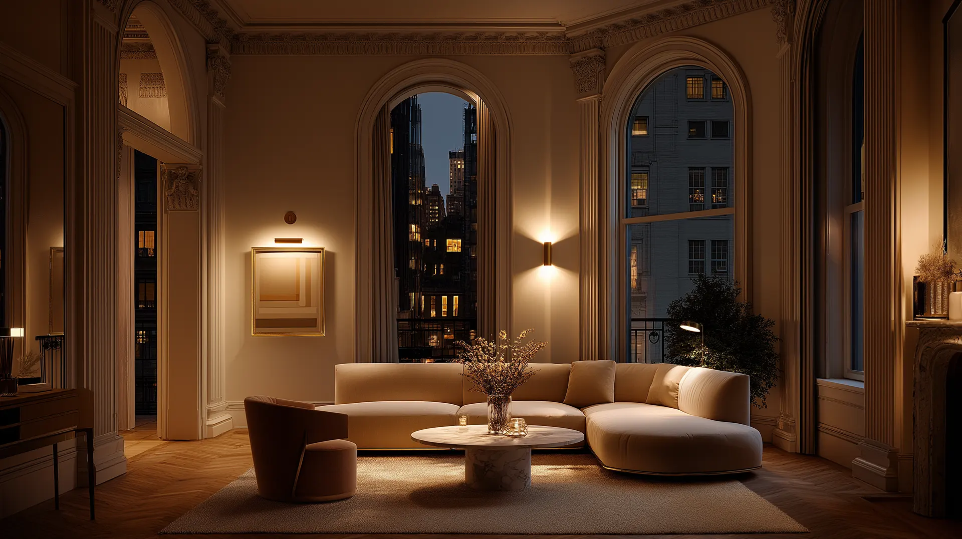
Important: Dark palettes only work when lighting is layered and intentional. Add an eye-level vanity light and a concealed strip to give the eye reference points.
Dark Bathrooms That Feel Intimate, Not Small
Painting walls and the ceiling the same deep color dissolves corners and creates a surprising sense of depth — especially effective in small powder rooms where you want drama without losing perceived space.
- Choose a dark tone with a warm or neutral undertone rather than pure black
- Introduce a mirror or band of metallic tile to bounce light
- Use low-glare, warm LED lighting to prevent coldness
- Use stone with veining or textured tile to prevent flatness

Accent Color With Restraint
Accent colors work best when they act like punctuation — a single saturated field creates impact without risking the entire room.
| Room Type | Accent Color Ideas | Where to Apply |
|---|---|---|
| Powder room | Plaster pink, mustard yellow, teal | Full wall or ceiling |
| Primary bathroom | Deep terracotta, olive, slate blue | Niche tile, painted vanity |
| Guest bathroom | Sage, soft coral, dusty lilac | Sпingle feature wall or cabinetry |

Rule of thumb: Bold color should read like a personality detail, not an architectural commitment. Keep all surrounding surfaces neutral and tactile.
The Technical Realities That Limit Color Choices
Color must survive moisture, cleaning, and time. A paint chosen for a living room may fail in a bathroom.
- Use moisture-resistant paint in satin or semi-gloss for walls in wet zones. Avoid flat finishes.
- For showers and wet walls, tile or cementitious finishes are the right choice.
- Light Reflectance Value (LRV) — lower LRV looks richer but requires more artificial light. Higher LRV reflects light and makes small rooms feel larger.
- Maintenance — medium-value neutrals hide water spots and limescale better than stark white. Deep colors hide staining but show soap scum on glossy finishes.
Choosing a Palette: A Simple Decision Framework

Start with fixture finishes — the metal will define your palette direction:
| Metal Finish | Pairs Best With |
|---|---|
| Brushed brass | Warm greens, beiges, terracotta |
| Matte black | Grey, charcoal, off-white |
| Polished nickel | Cool blues, rich chamois, soft whites |
| Aged bronze | Deep greens, warm browns, stone tones |
Always test on-site. Apply a large paint swatch on the wall and check it in both morning and evening light. Place tile samples next to the painted swatch — tile reflections alter perceived color.
How to Decide What You Want the Bathroom to Feel Like
| Desired Mood | Color Direction | Lighting to Match |
|---|---|---|
| Morning clarity | High-LRV neutral, crisp white | Bright, high-CRI task lighting |
| Evening relaxation | Muted green, warm beige | Warm ambient, dimmable |
| Drama & impact | Deep charcoal, navy, forest green | Layered: vanity + accent strips |
| Personality without risk | Neutral walls + saturated accent niche | Highlight lighting on accent area |
Practical Finishing Tips
- Select tile and grout as a system. Grout color changes perceived warmth and pattern density.
- Invest in mid-range moisture-resistant paint. Higher pigment and better coverage mean fewer coats and a more even result.
- For underfloor heating, choose wood-look porcelain — it reads warm and won’t delaminate with heat.
- Use high-CRI bulbs at the vanity to render skin tones accurately.
- Add dimmable layers so the same color palette reads differently morning vs. evening.
Opt for colors with a high Light Reflectance Value (LRV), such as crisp whites, soft greys, or pale blues. Alternatively, going entirely dark — like deep charcoal or navy — can blur the room’s edges and create an illusion of depth.
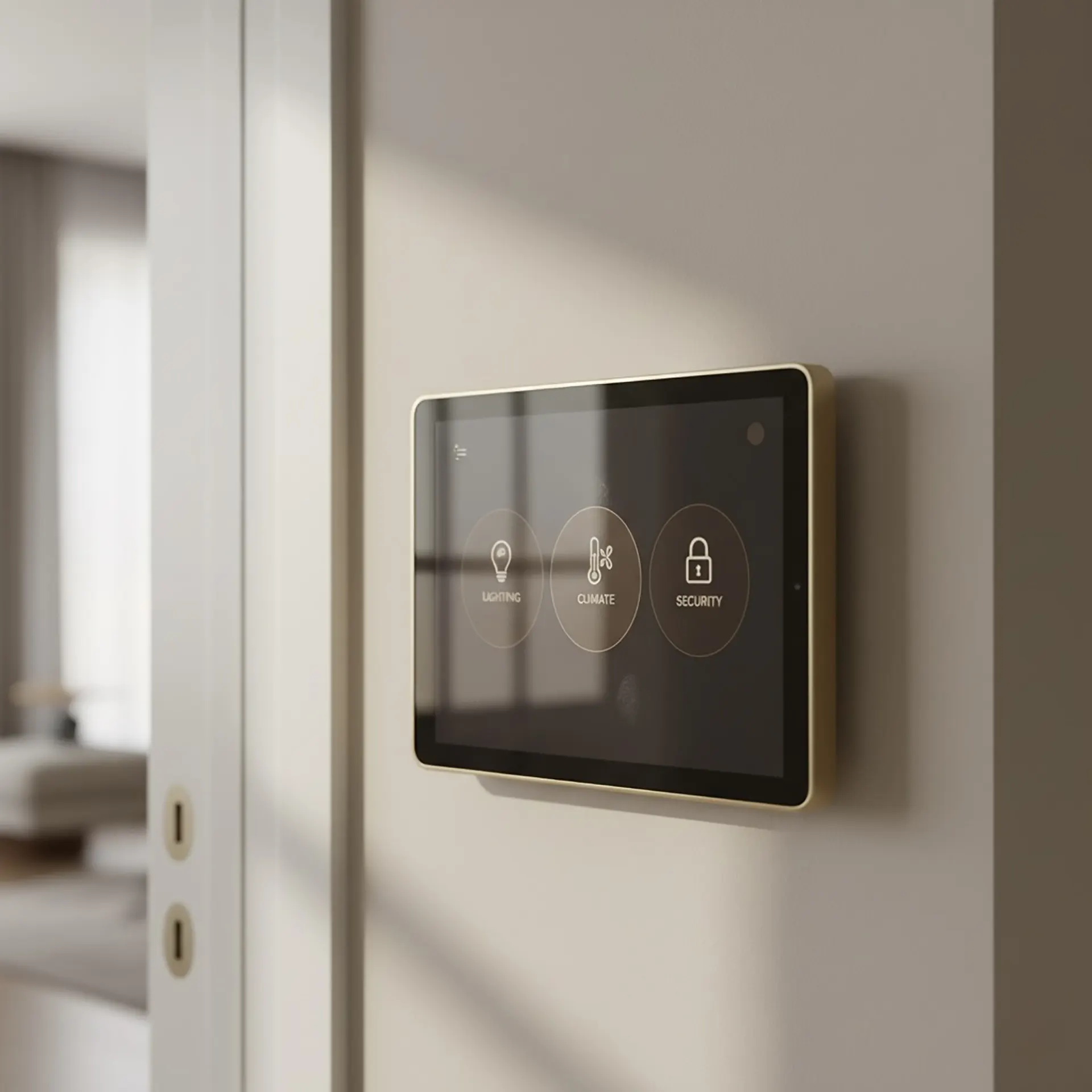
Smart Homes, Smarter Living: Integrating Technology into Your Renovation
The concept of a “smart home” has evolved beyond the fantasy of controlling everything by voice.

When Space Tells a Story: Designing Homes with Character, Not Just Style
There is a specific feeling you get when you walk into certain homes. You know instantly—someone l
The Secret Life of Light: How Lighting Can Make or Break a Room
Light possesses an almost magical ability to transform spaces, yet it remains one of the most undere